Industry
- Hospitality
Services
- Brand Identity
- Environmental
- Packaging
- Print Collateral
Etta
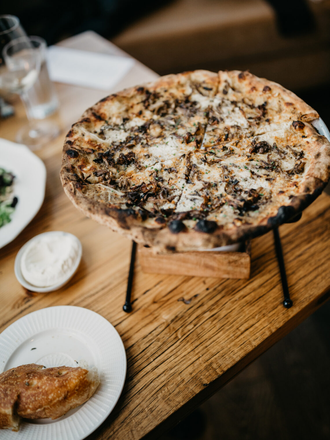
Named for the fire that makes it.
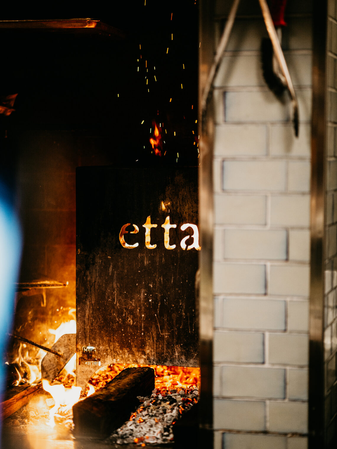
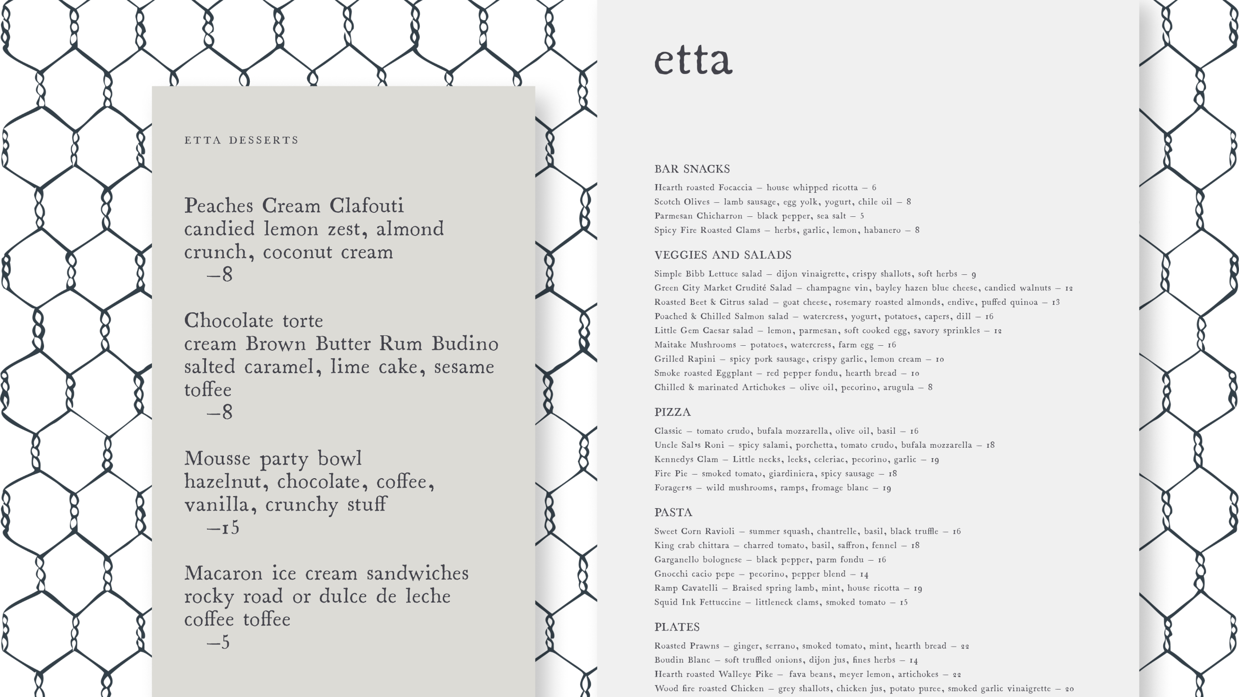
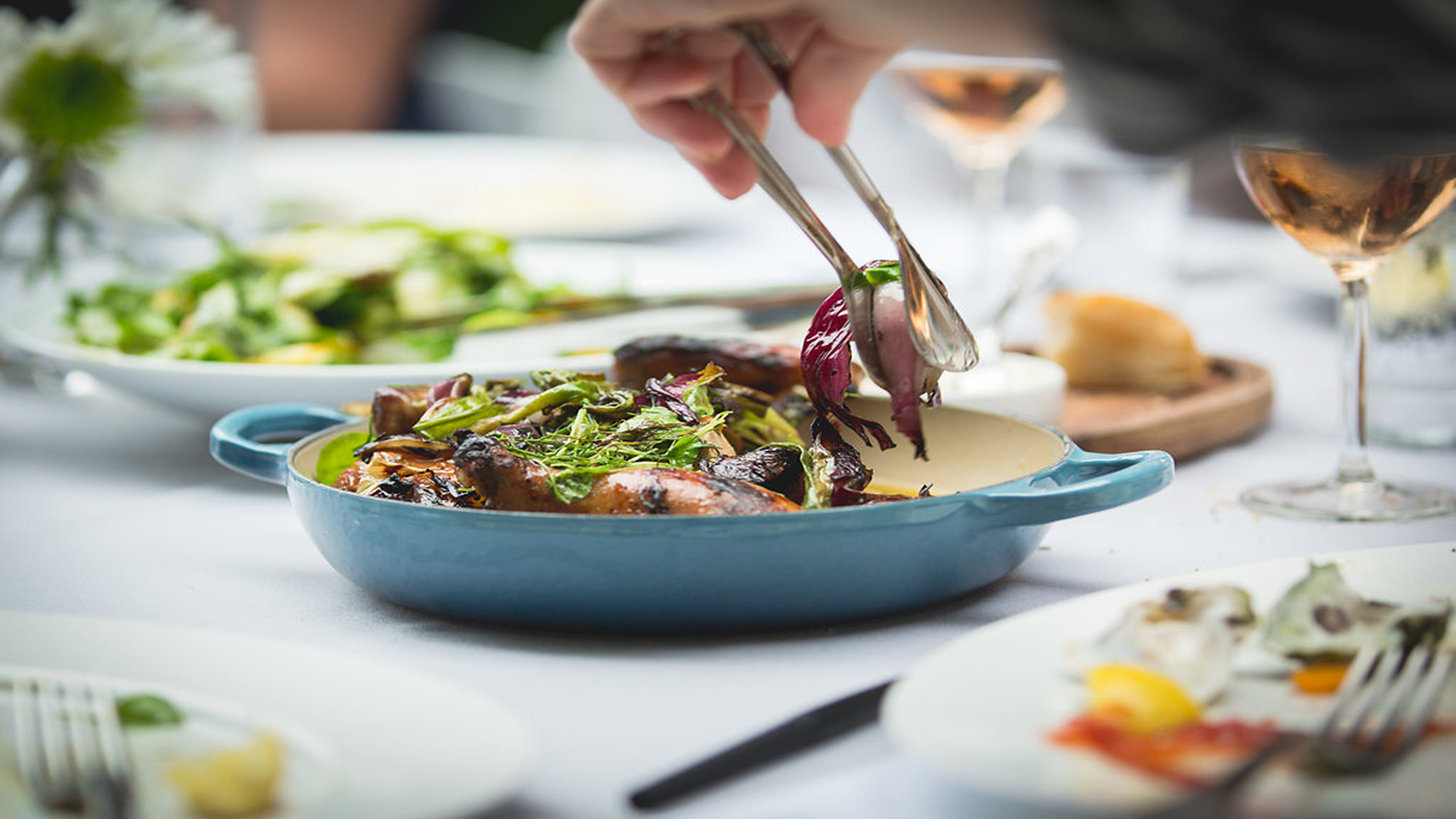
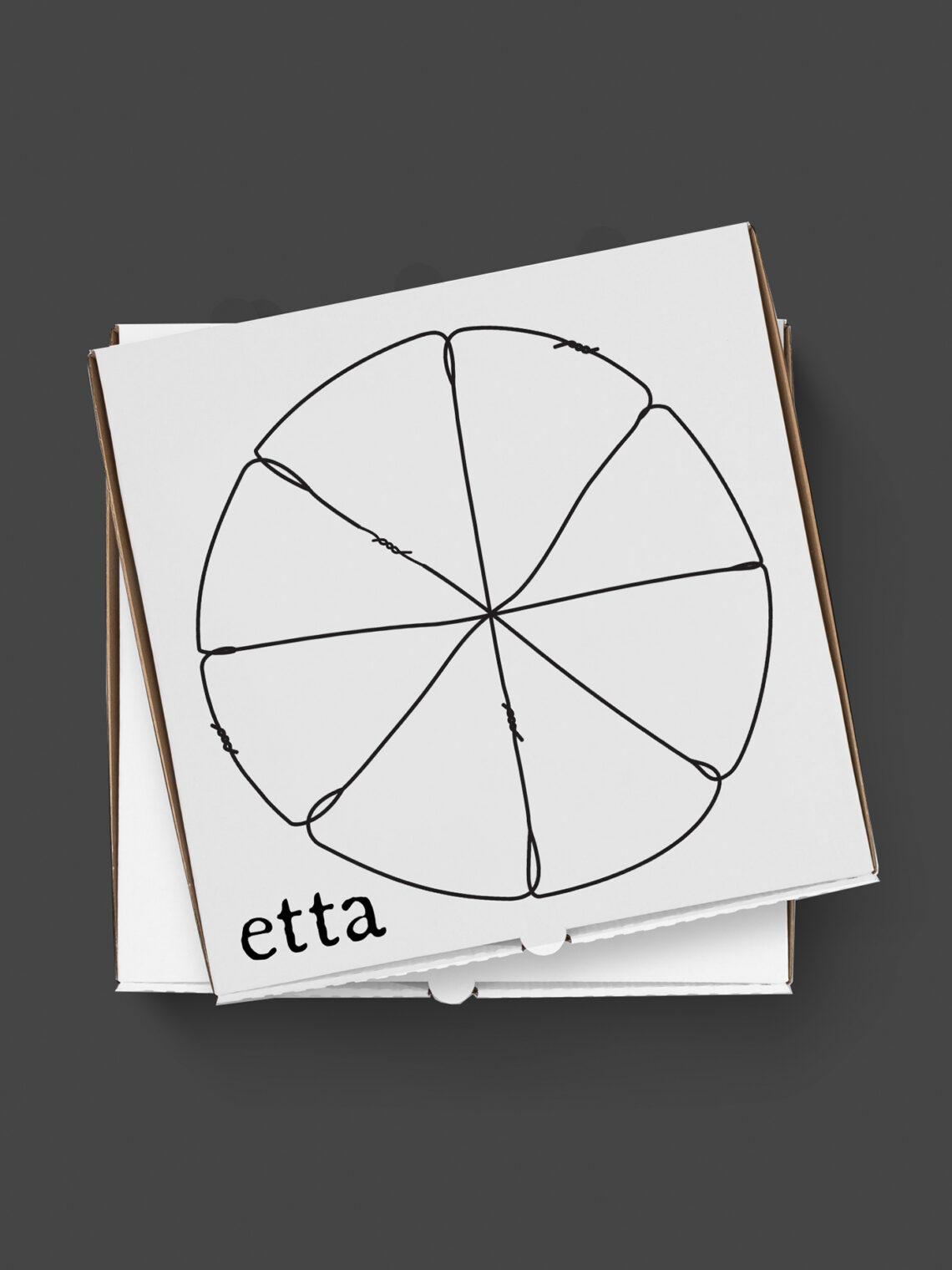
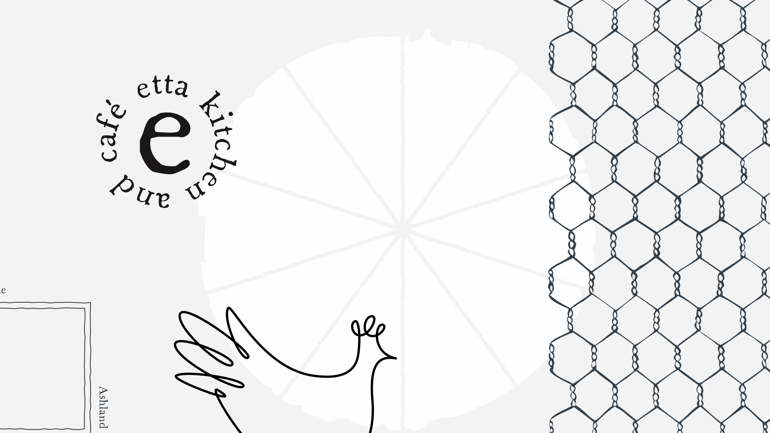
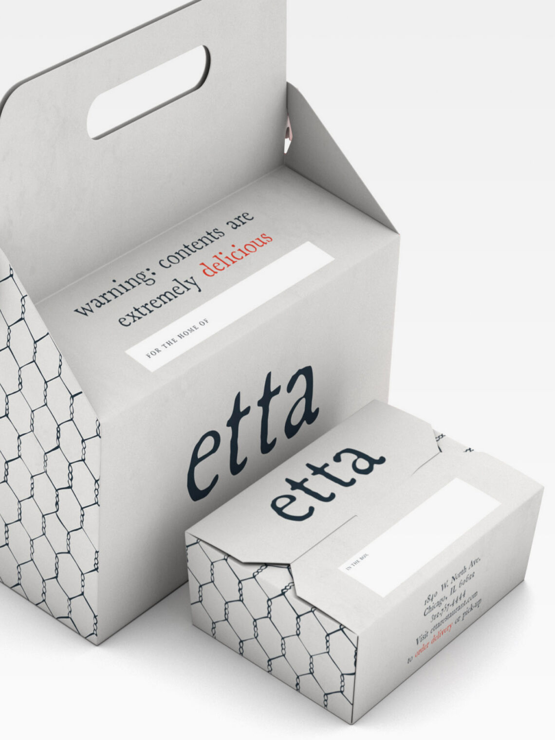
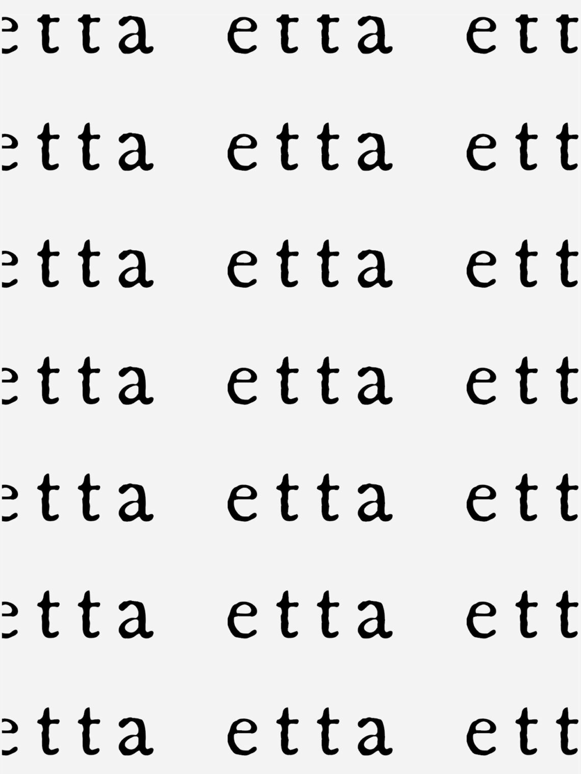
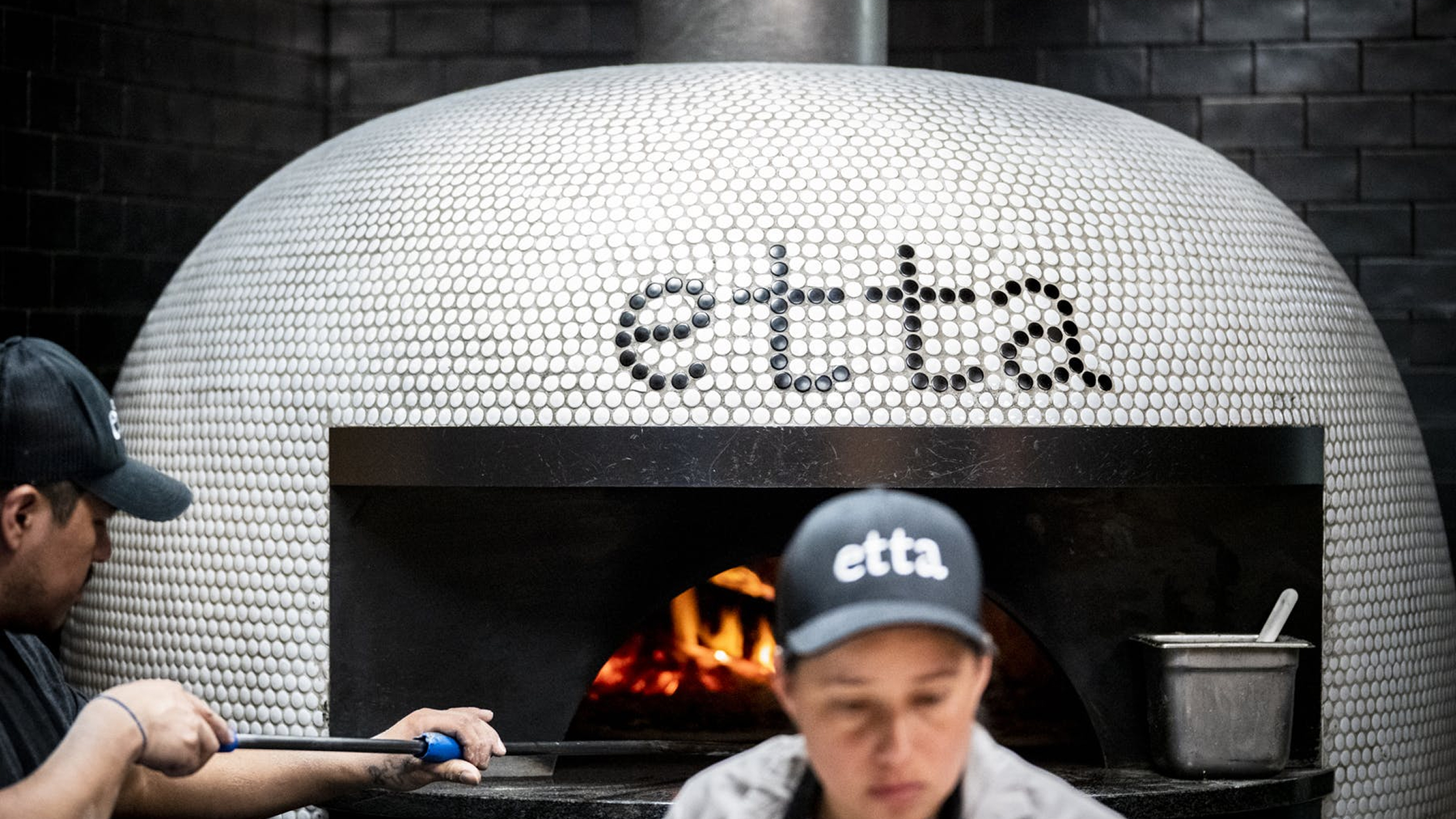
Etta was Maple Hospitality Group’s wood-fired neighborhood restaurant, named from the French Henriette, “keeper of the hearth,” with chef Danny Grant’s open kitchen built around exactly that. WHQ, already the team behind Maple & Ash, built Etta’s identity to be warmer without being softer: rustic serif typography that looks drawn rather than set, a hand-drawn illustration system across menus and collateral, and a monogram that could be etched into tile, embroidered on uniforms, or die-cut from steel, so the brand reads as part of the architecture rather than signage attached to it. Etta opened in Bucktown in 2018, earned mention in the MICHELIN Guide, and the system carried it to River North and Scottsdale.