
Industry
- Healthcare
Services
- Data Visualization
- UX and Interface Design
- Website
Platforms
- Apple App Store
Metria
Five thousand data points a minute, designed to feel like one.
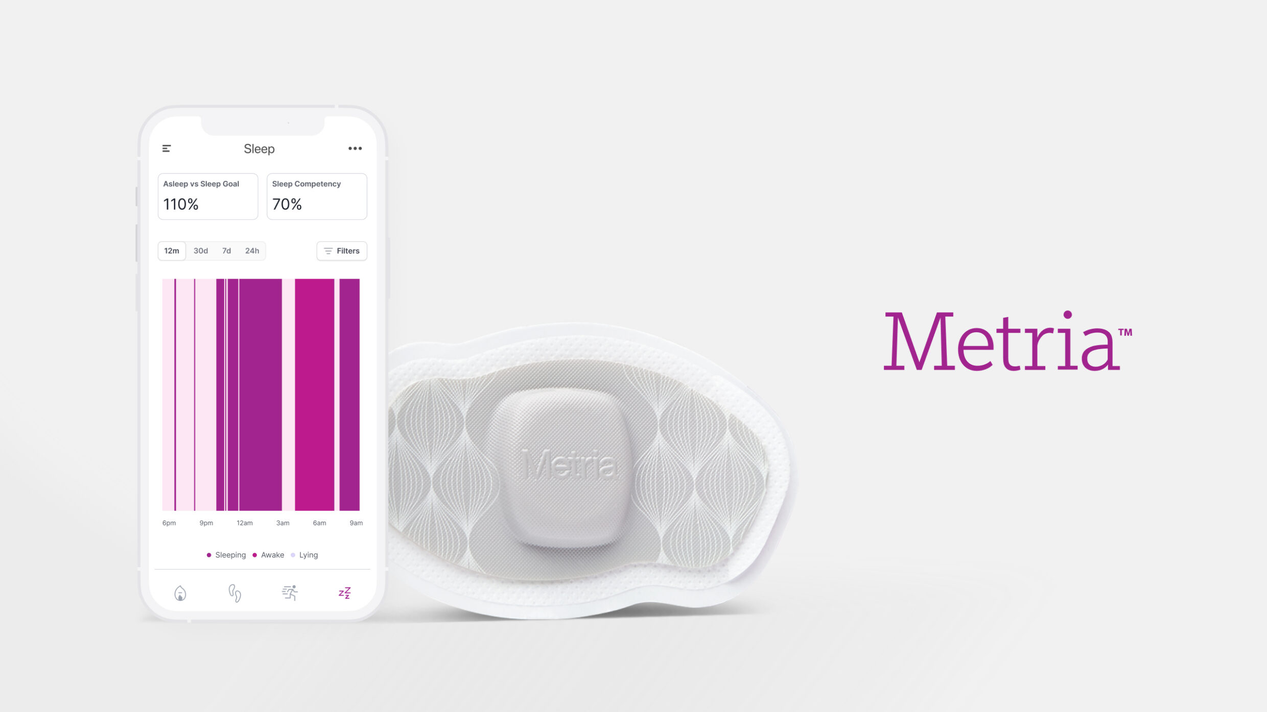
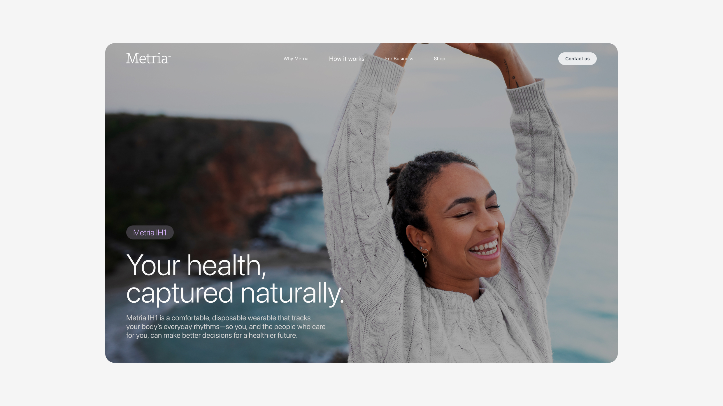
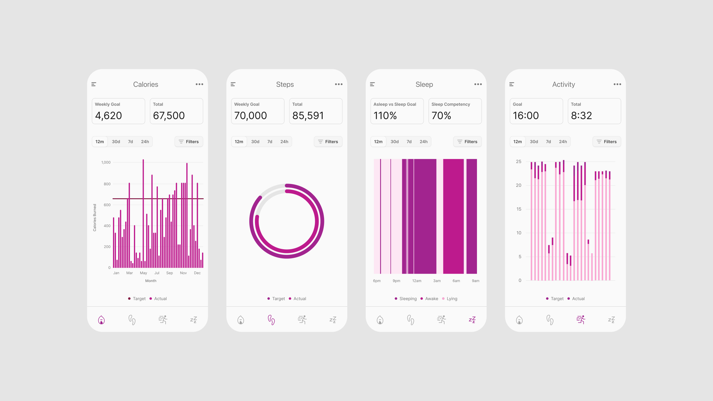
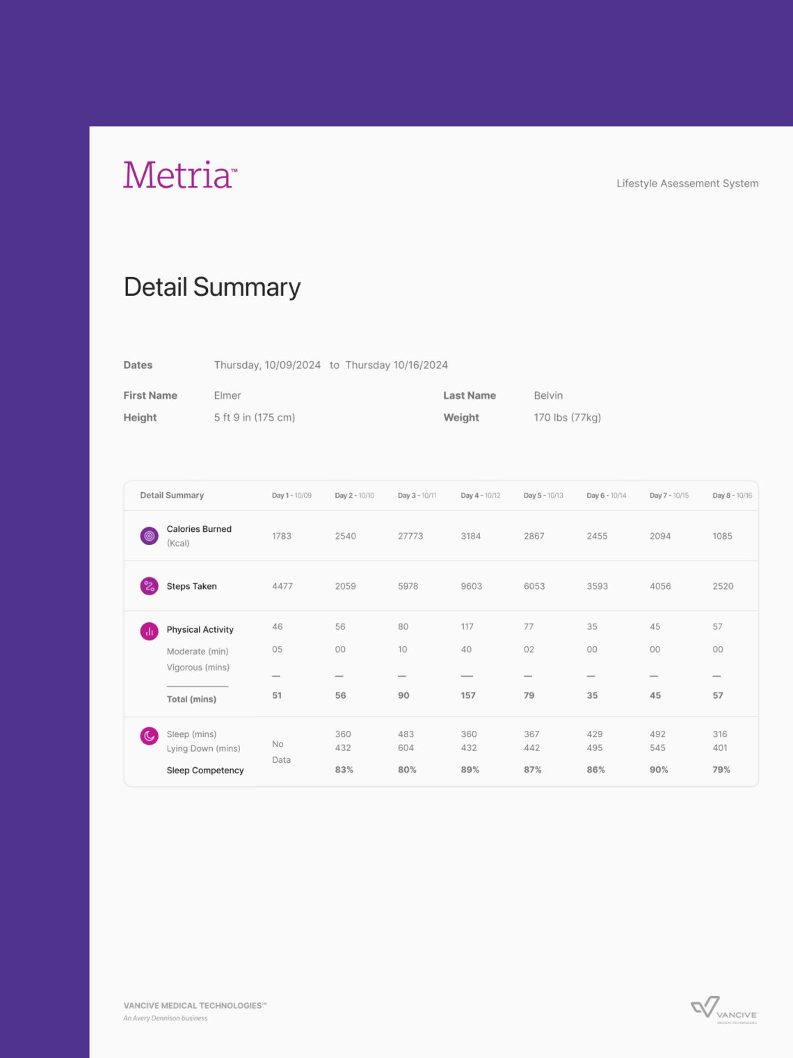
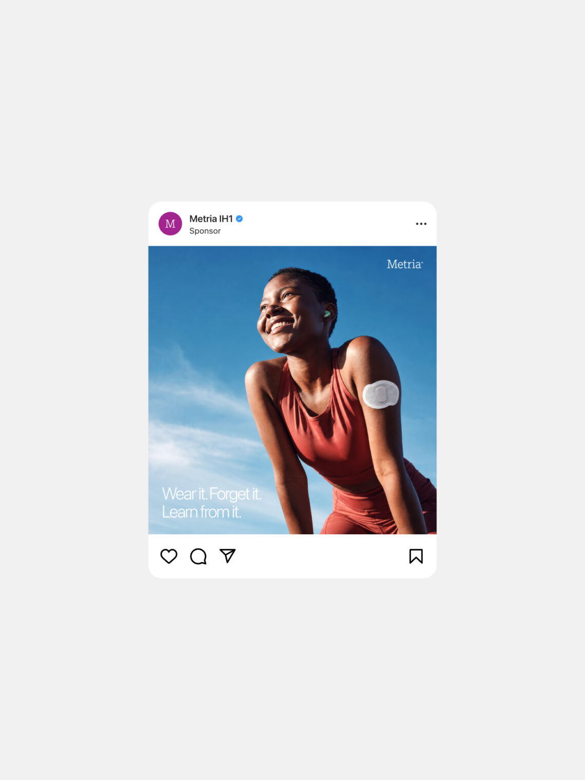
The Metria IH1 was not a fitness tracker. It was a clinical-grade wearable sensor from Vancive Medical Technologies, an Avery Dennison business, that collected more than 25 distinct data types at over 5,000 readings per minute, worn continuously on the upper arm for seven days before syncing. Built for medical research, health insurance, and personal health management, it was among the most technically sophisticated consumer-adjacent wearables of its era. Vancive brought WHQ a problem that was simple to state and genuinely difficult to solve: build an app and web experience that worked equally well for the everyday person who wants to understand their health and the medical professional who needs everything the device recorded.
01 The brief
Designing for a device nobody had used before
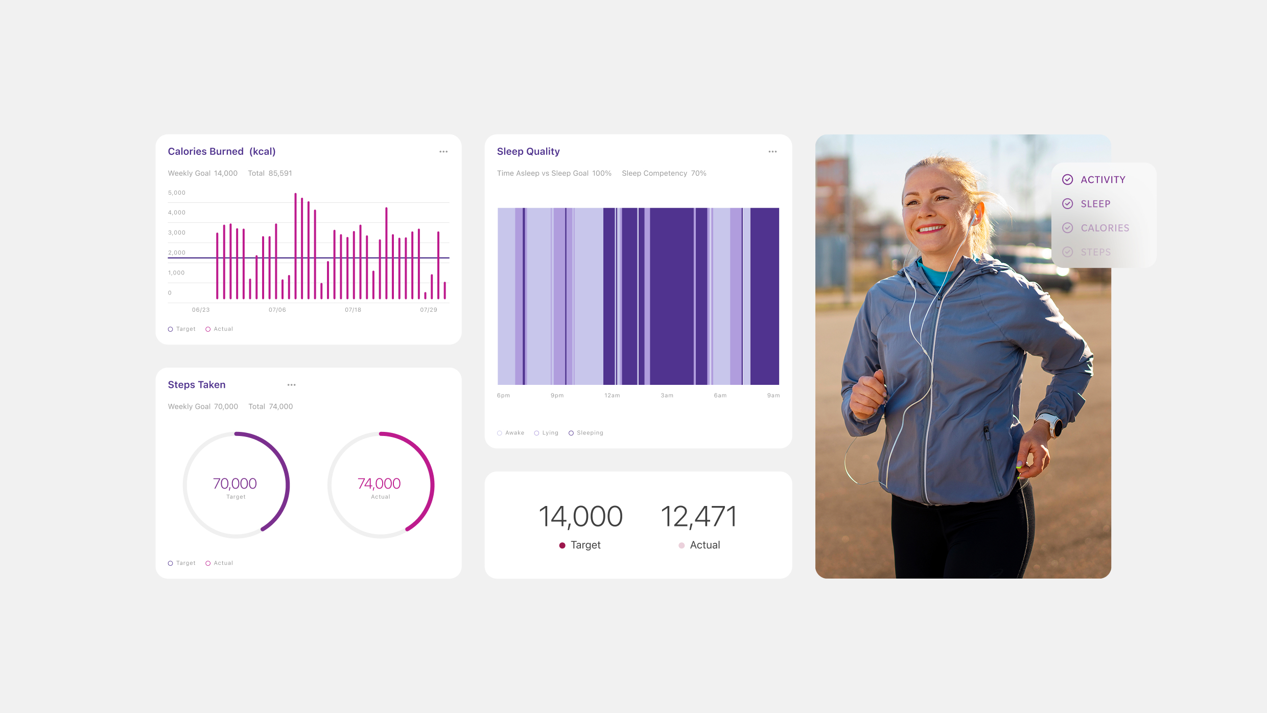
The Metria IH1 sat at an unusual intersection. More medically rigorous than any consumer fitness tracker, measuring skin temperature, galvanic skin response, heat flux, and three-axis motion simultaneously, but designed to be worn and interpreted by people with no clinical training. The interface had to make that data legible to a general audience without stripping the depth that researchers and health professionals depend on. The more fundamental problem: the team designing the interface had never experienced the data it was being asked to visualize. A week of continuous readings isn’t a spreadsheet. It has texture, patterns, anomalies, and moments you only recognize by living through the collection period yourself.


02 The insight
To design the experience, the team had to live it
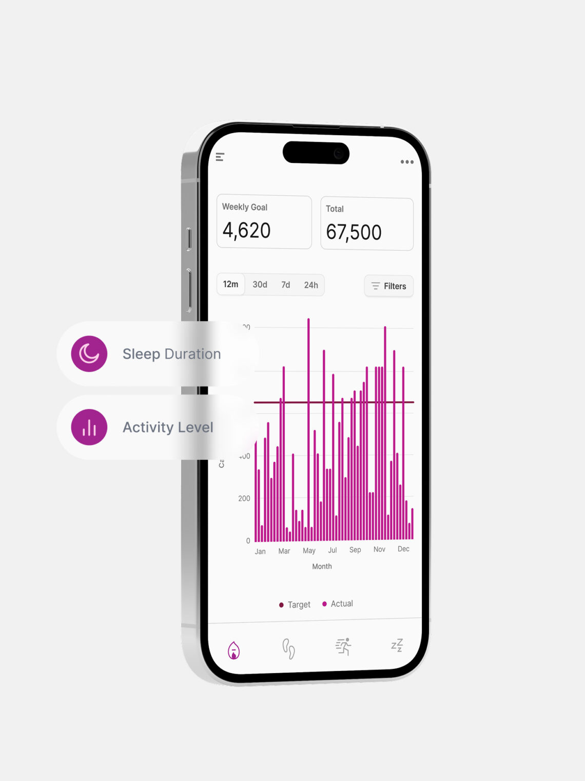
Wearing the device changed the project. Seven days of continuous data generates familiarity you can’t get from a spec sheet, you start recognizing patterns, connecting readings to specific moments, and understanding which numbers matter without context and which ones don’t. That knowledge became the foundation of the interface. The design problem wasn’t two levels of the same experience. It was two distinct modes of engagement with the same data: the consumer needed clear, scannable, actionable summaries; the medical professional needed the complete data set, accessible without friction. Neither audience should have to navigate around the other. The solution held both without compromise.

03 The build
Clinical-grade infrastructure with a human-centered front end
Connecting the IH1’s onboard data to the application required a custom API written by WHQ. An OAuth 2 server handled authentication, restricting Metria data access to authorized developers, a requirement for a product operating at the intersection of consumer health and clinical research. The web experience was built in Laravel, deployed as a static serverless site to S3 for performance. WHQ brought the front-end architecture; Vancive’s team brought the backend. Two teams, different specializations, one standard: rigorous enough for medical professionals, approachable enough for anyone who wanted to understand their own body.
The result
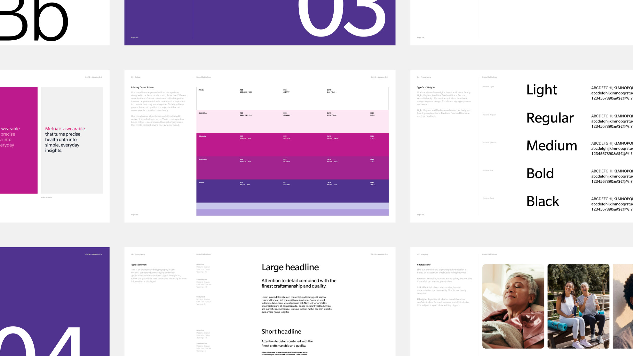
The Metria app gave a device of genuine clinical sophistication a companion experience that served both audiences it was designed for, without asking either one to compromise. The dual-mode interface solved the core design problem cleanly. The custom API and OAuth 2 infrastructure gave Vancive a platform with the access controls and extensibility that clinical and commercial applications require. For a product category still finding its footing, Metria demonstrated what it looks like when the software is as serious as the hardware.