Industry
- Hospitality
Services
- Brand Identity
- Environmental
- Print Collateral
- Website
Partner Since
2021
Rose Mary
A personal brand with Adriatic soul.
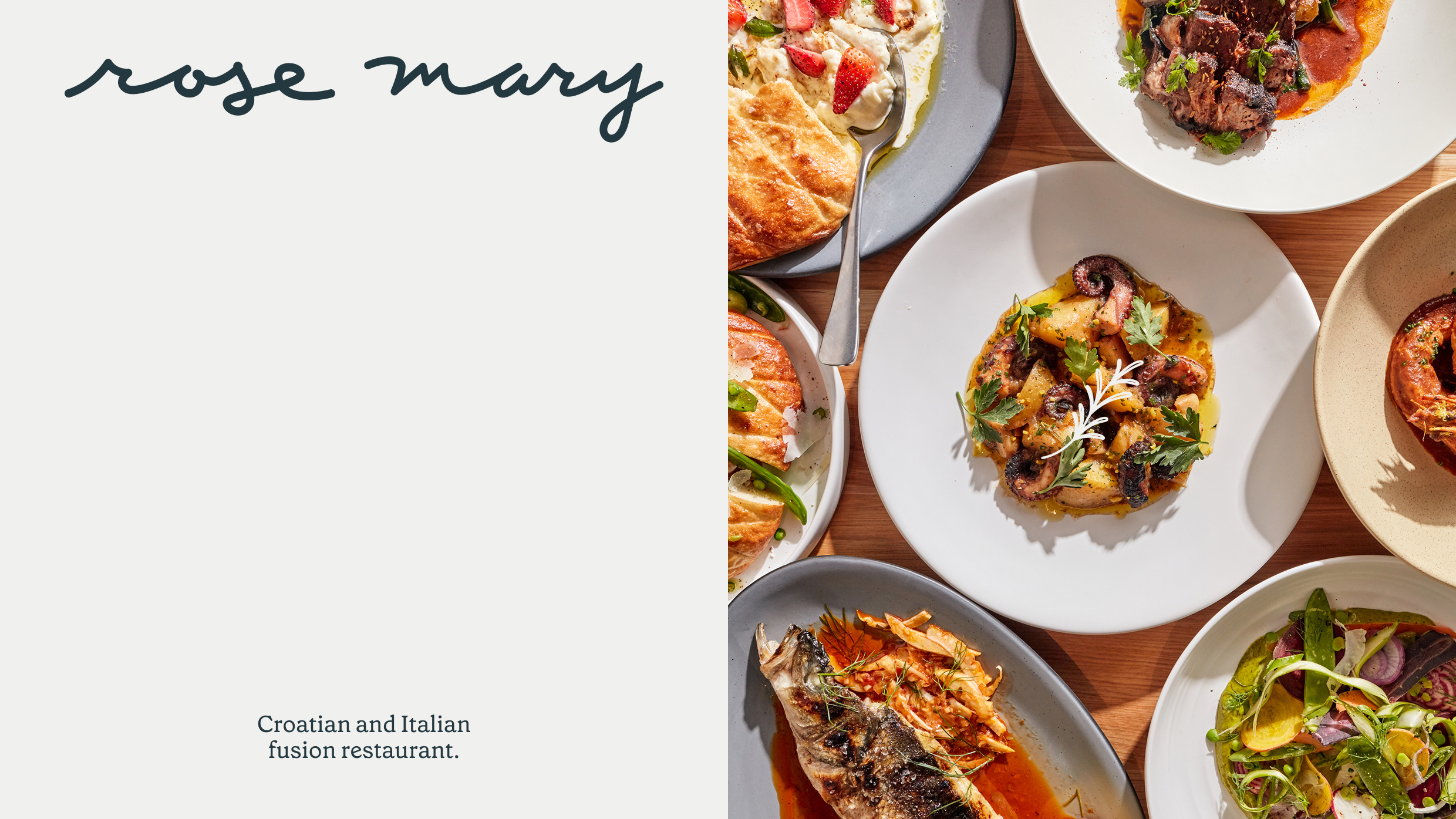
When Top Chef winner Joe Flamm and the Day Off Group set out to open their first restaurant together, they weren't chasing a concept. They had one, specific, personal, and already fully formed. Rose Mary would be Italian-Croatian, rooted in the flavors of the Adriatic coast, built around what Flamm calls "Adriatic drinking food."
01 — The brief
Three stories at once
The name carried three stories at once: the two grandmothers who taught Flamm to cook, the herb that grows wild along the Croatian coastline, and the spirit of the konoba, the family-run coastal tavern where food and company are equally serious. The restaurants that feel right, feel like they’ve been there for years. That was the standard Rose Mary set. A concept this specific, this personal, and this rooted in real heritage couldn’t afford a brand that felt invented. It needed to feel discovered.

02 — The insight
The brand had to feel like it already existed
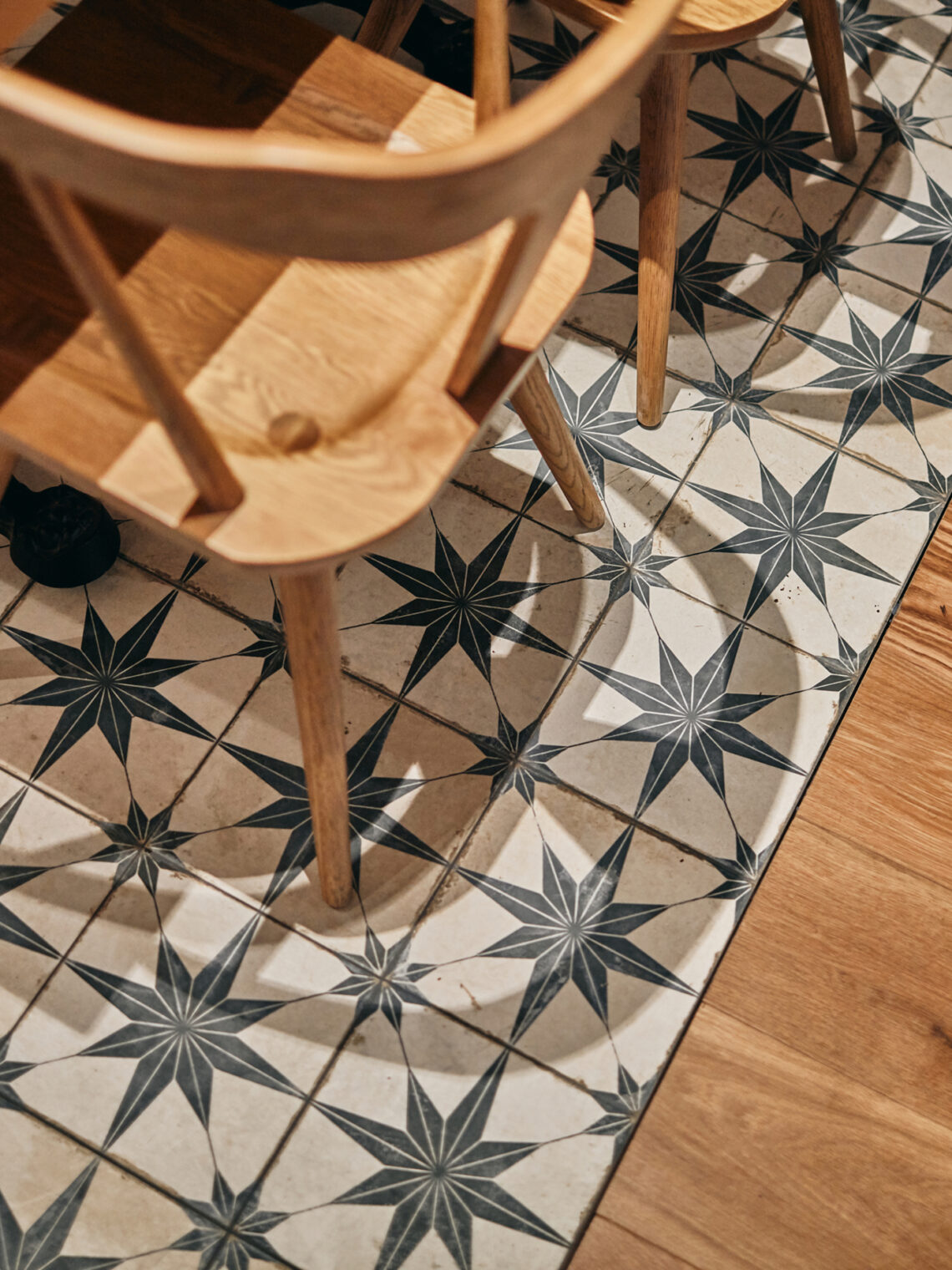
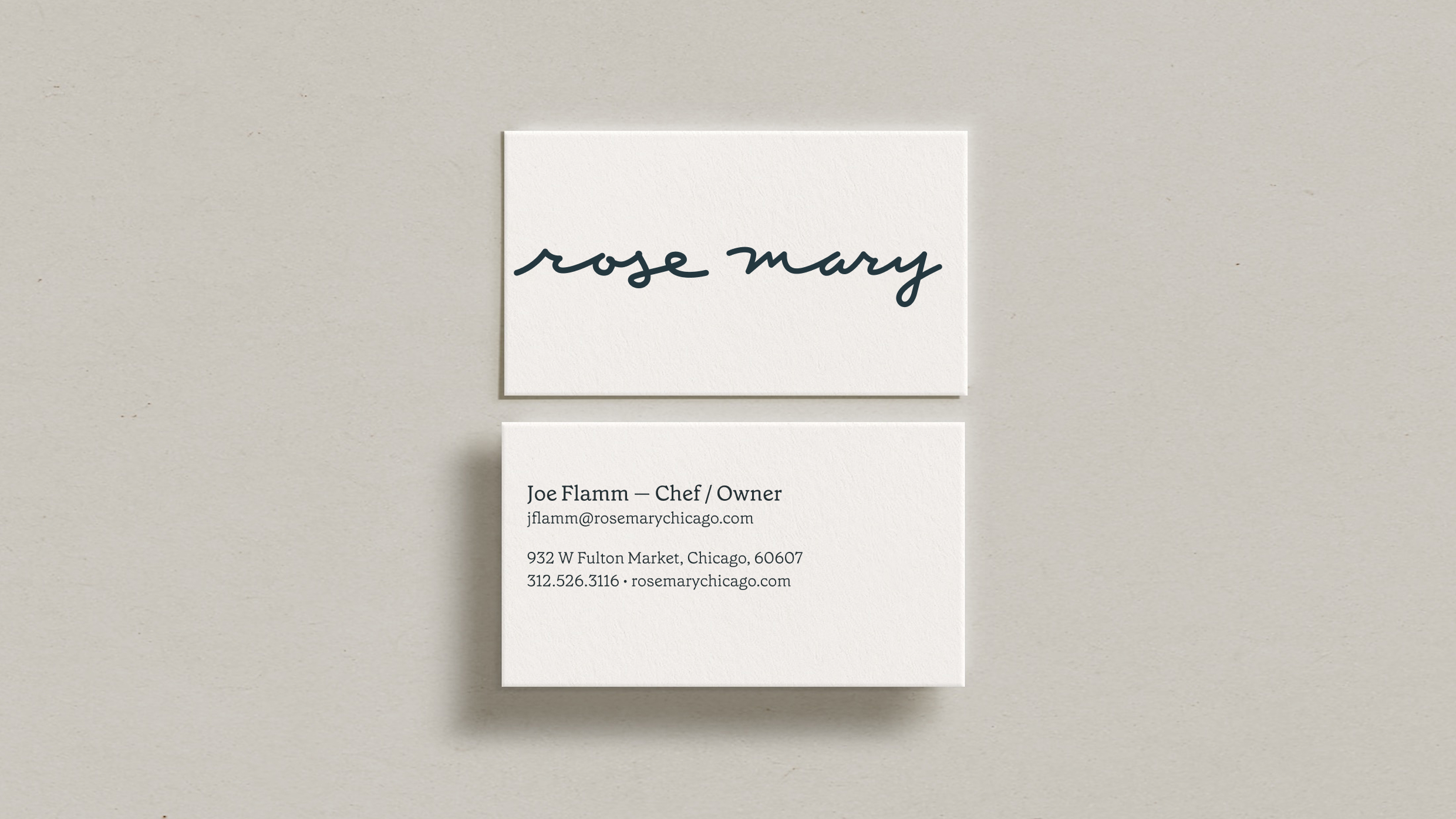
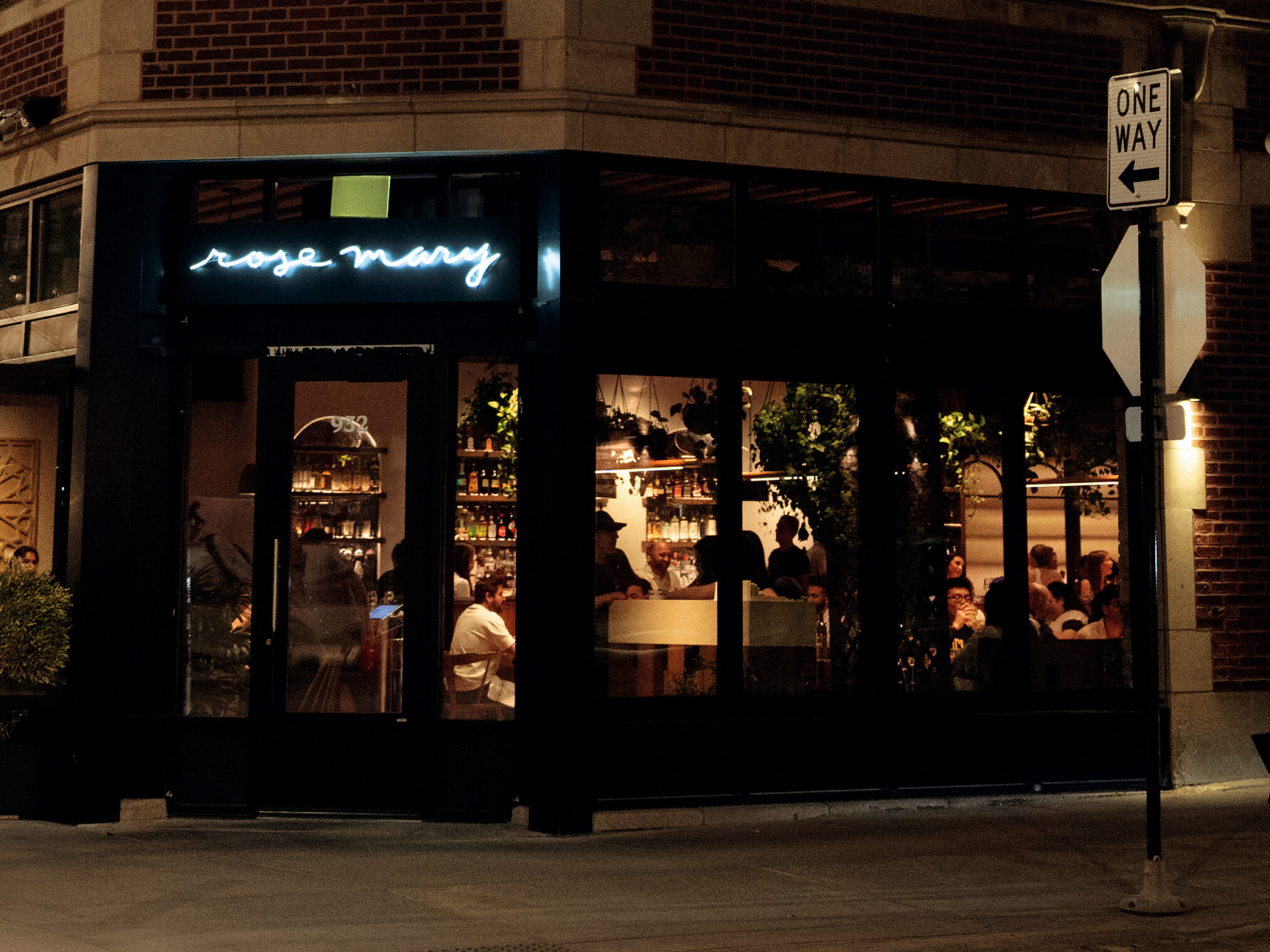
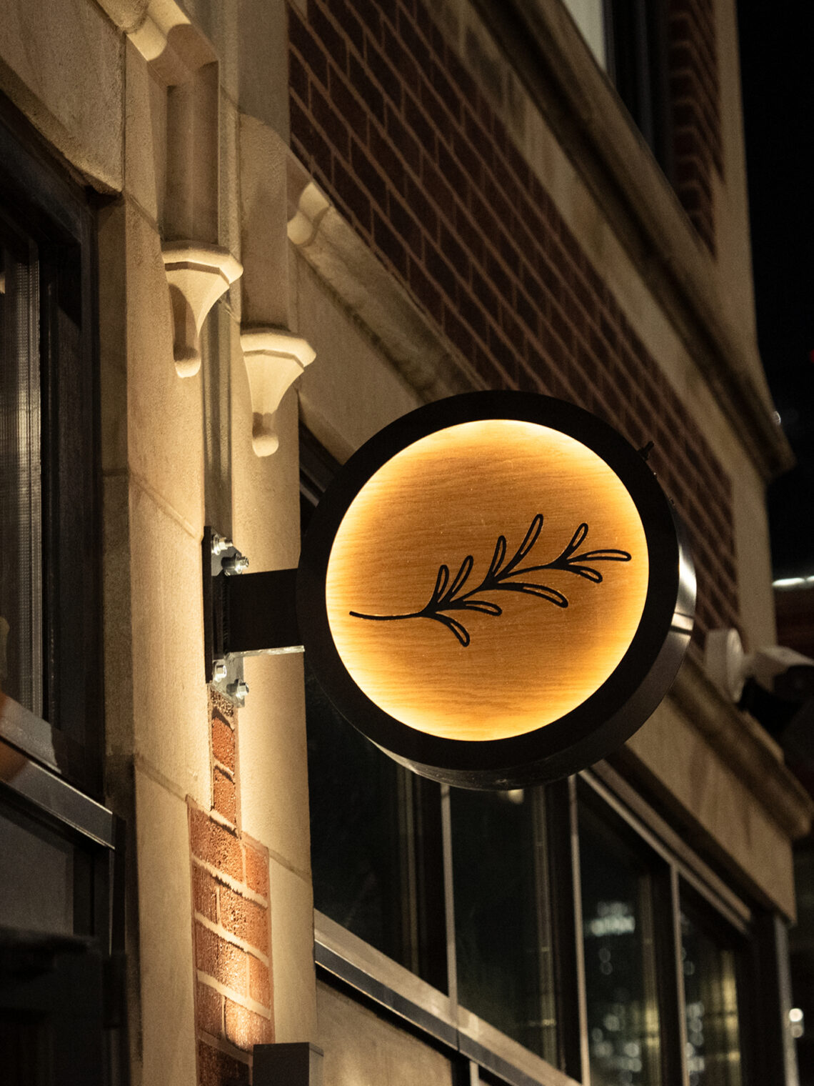
The visual language we built leans into the utilitarian confidence of the konobar, the Croatian tavern keeper who doesn’t decorate, doesn’t perform, just provides. Rustic without being rough. Warm without being sentimental. The logo is simple and direct, with the character of something hand-drawn rather than engineered. The hand-painted exterior signage doesn’t announce itself, it belongs. The illustration system carries the personality of the place without explaining it. Every element was designed to feel like it had been there all along.
03 — The creative
Every touchpoint as part of the same story
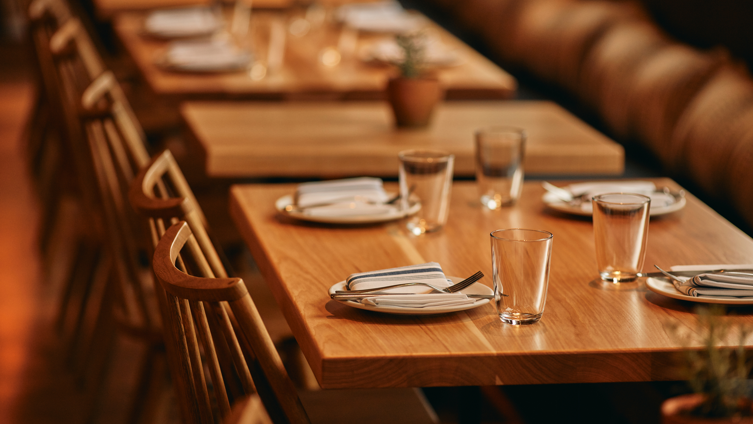
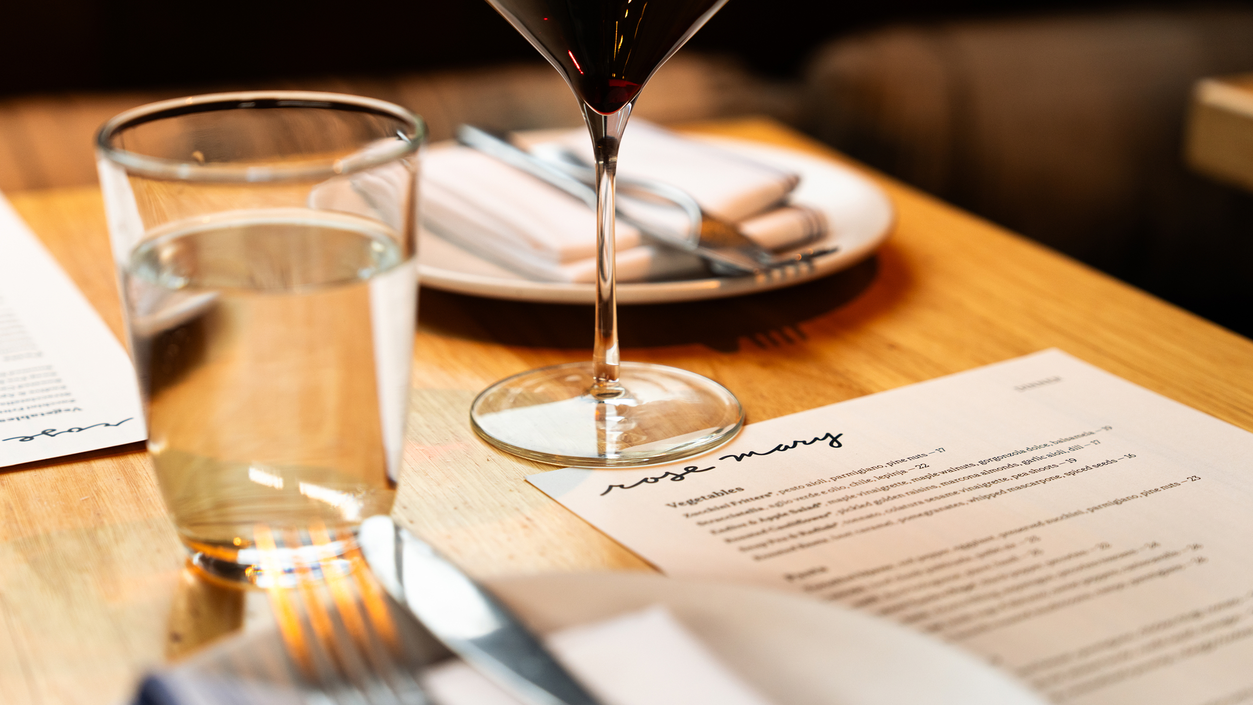
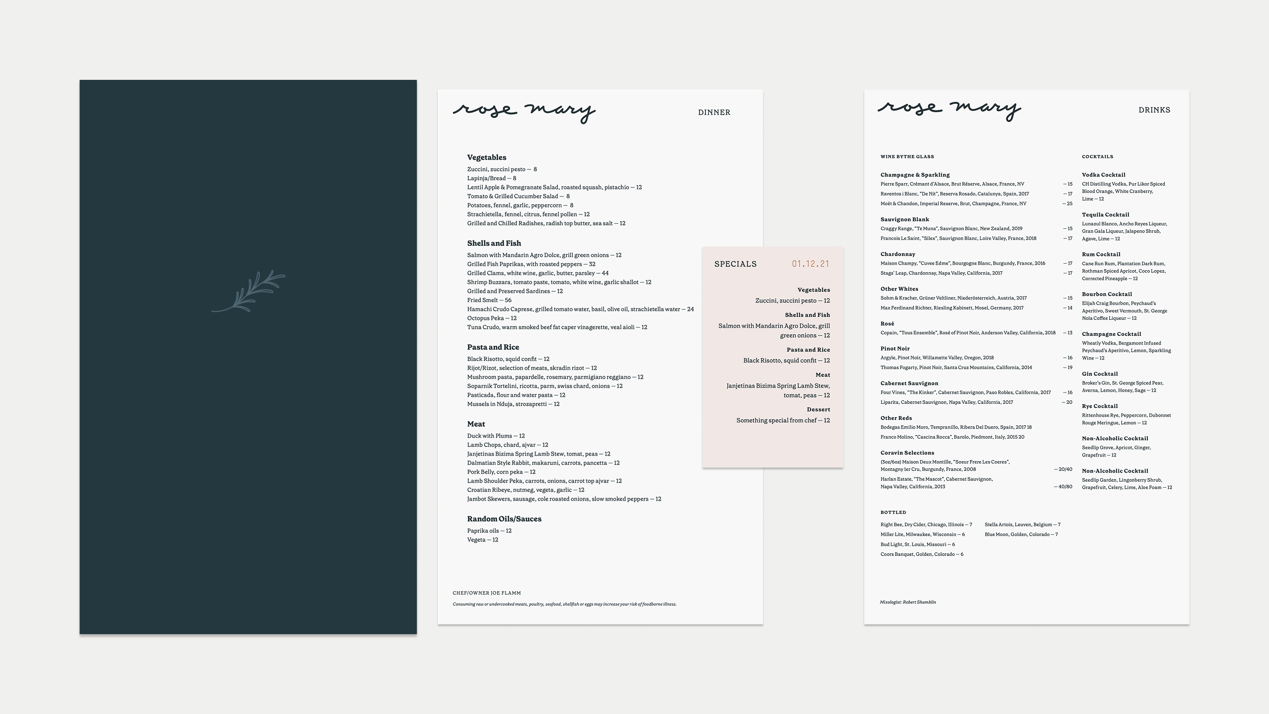
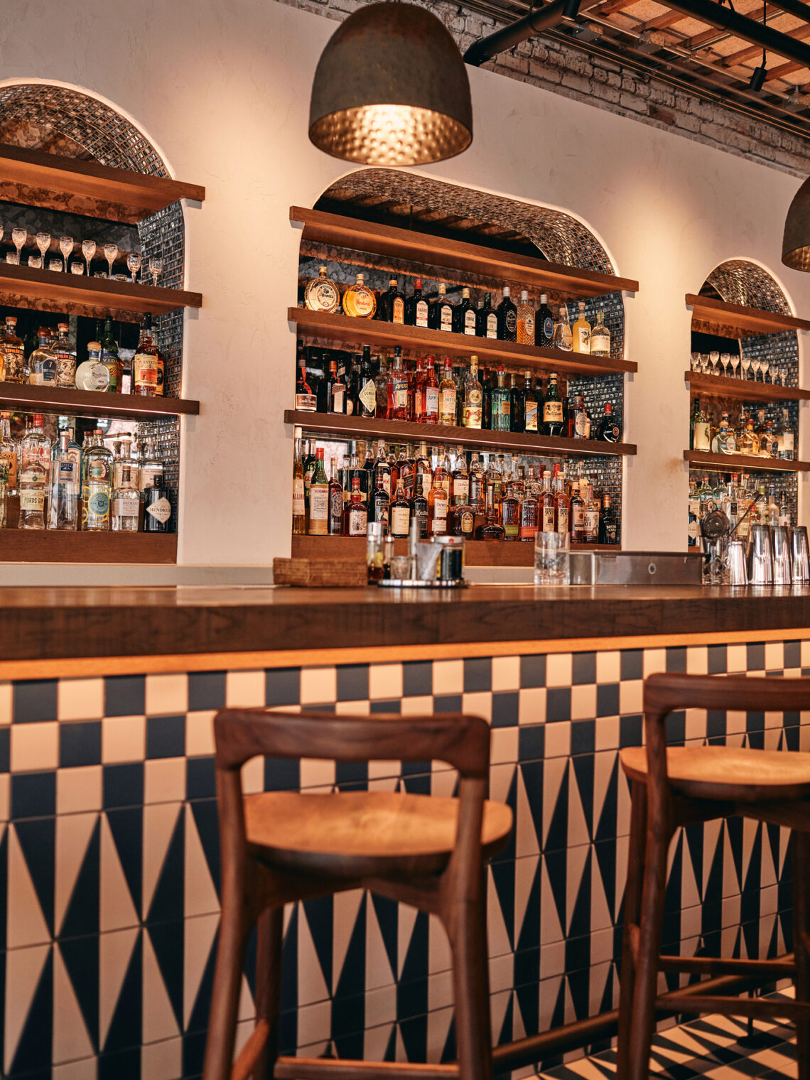
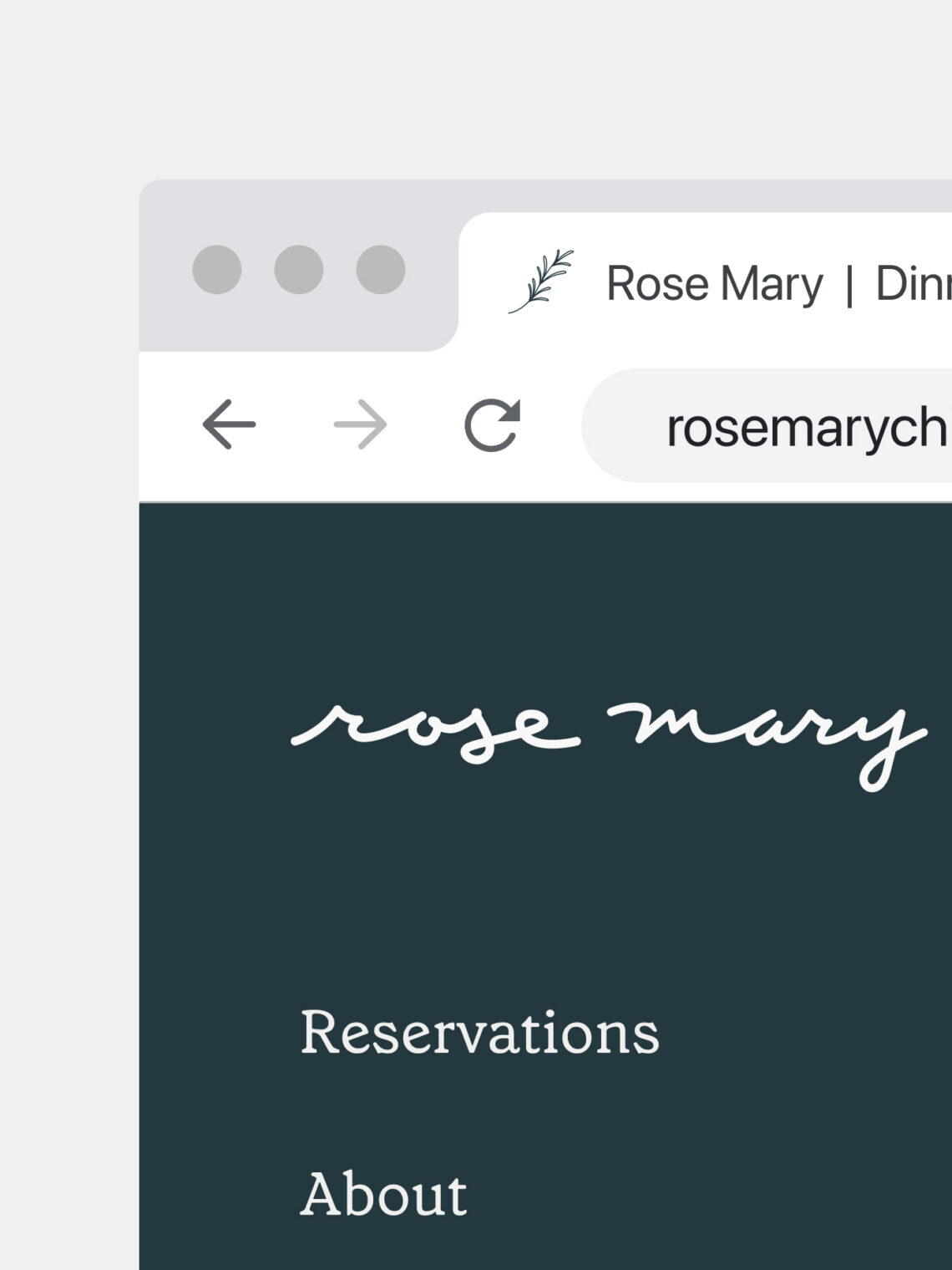
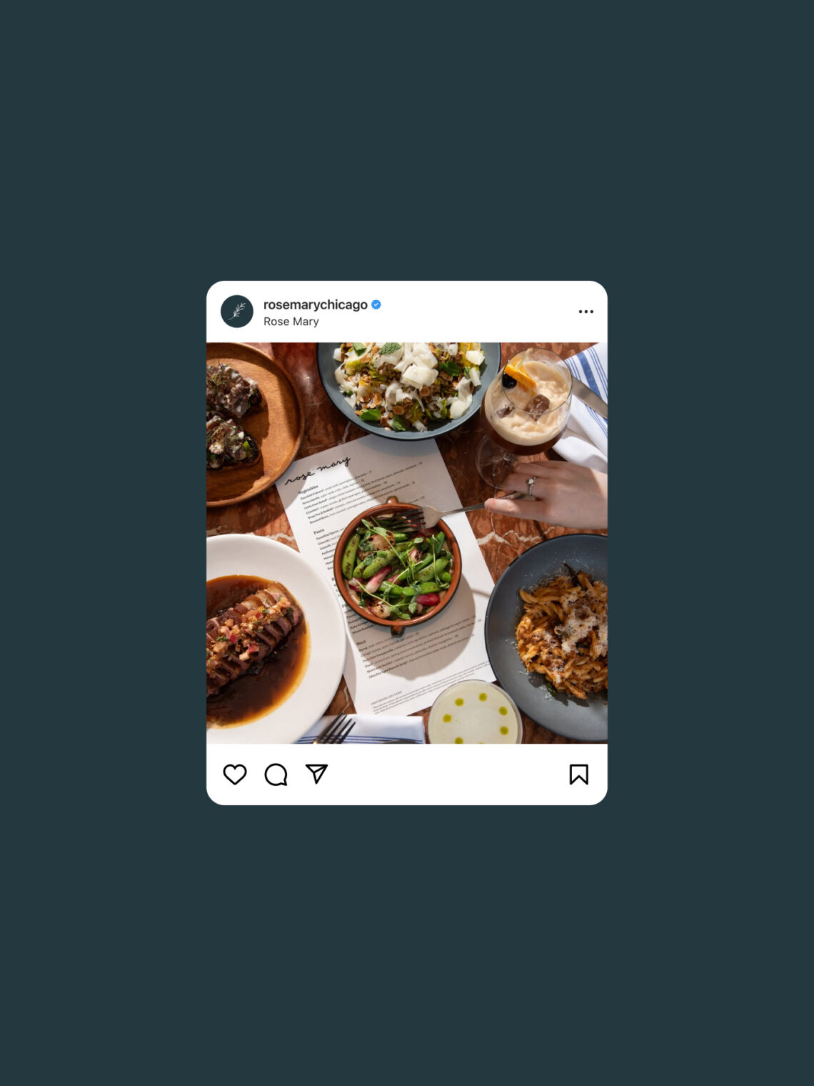
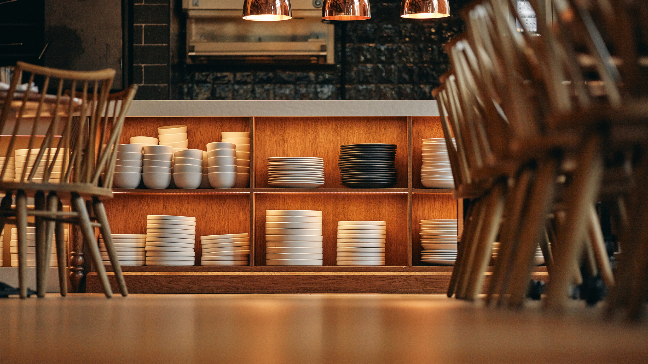
The brand extended across everything a guest encounters, the hand-painted exterior sign visible from the street, the menus they handle through the meal, the interiors they sit inside, the illustrations that give the system life, the website and social presence that introduce the restaurant before anyone walks through the door. None of it was decorative all of it was narrative.
Copywriting gave the brand a voice that matched the food, direct, warm, and specific without being precious. Brand guidelines gave the Day Off Group team the tools to extend the identity consistently as the restaurant grew. The result is a system that travels, from a walk past the exterior to a first visit to a second and third, without ever feeling like it’s trying to sell something.
The result
Rose Mary opened and immediately became one of the most coveted reservations in Chicago. Food & Wine and Robb Report named it a most highly anticipated opening. The Chicago Tribune, AFAR, and TimeOut Global named it a best new restaurant. Eater Chicago placed it among the 38 essential restaurants in the city. The New York Times recommended it. The MICHELIN Guide took notice. For a concept this personal and this specific, the recognition is a direct reflection of how clearly the restaurant communicated what it was, before a guest ever tasted the food. Rose Mary is part of an ongoing creative partnership with Day Off Group.