John Burns
Built for the job site, not the pitch deck.
Since 1906, John Burns Construction has built the physical infrastructure that connects people to the systems they depend on every day. Water mains, sewer lines, telecommunications networks, transit systems, and utility infrastructure across Illinois and Texas. Essential, disciplined, and largely invisible to the people whose lives it supports.
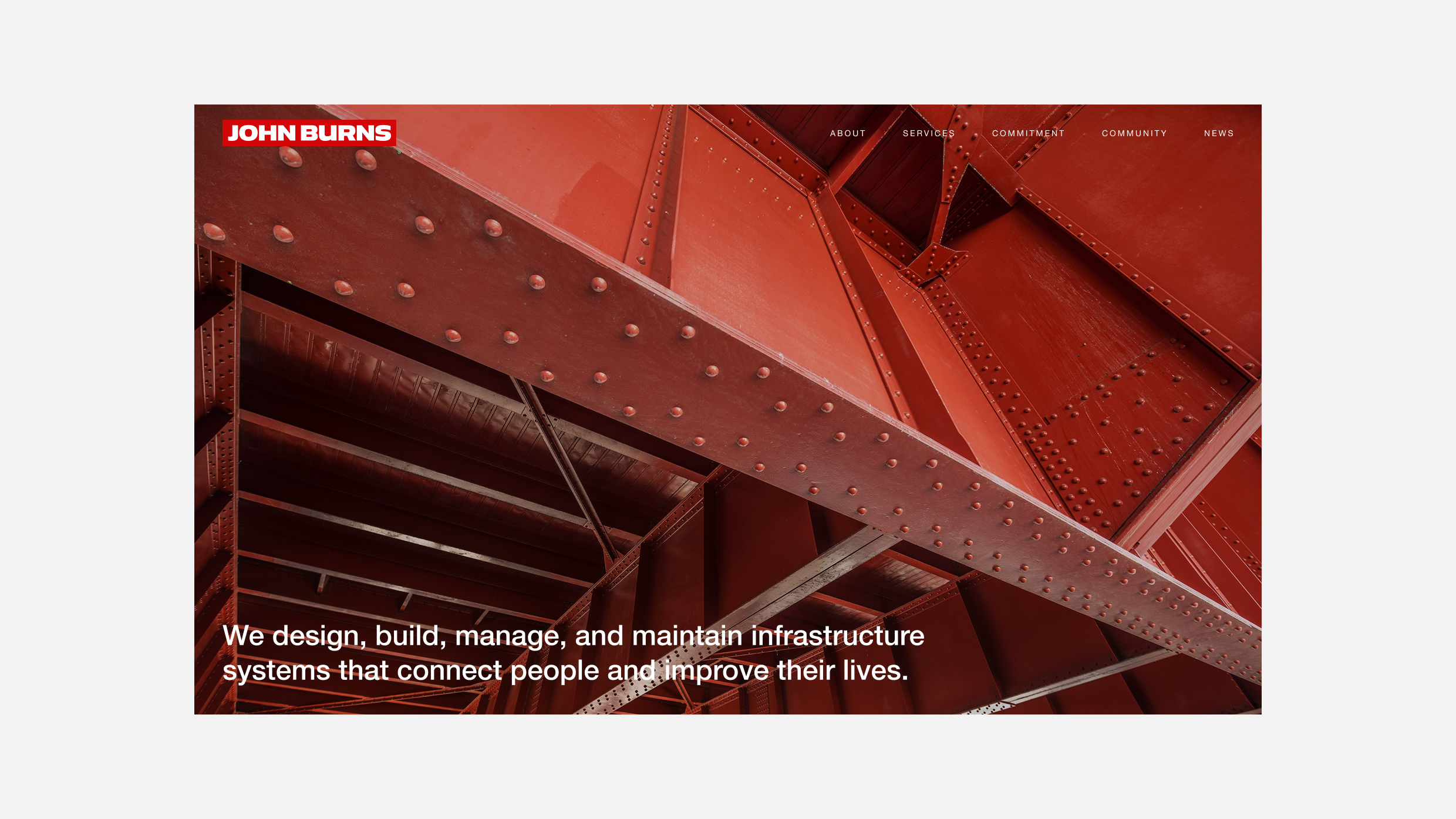
A company with that much history and scale had a brand that no longer matched the business. The identity had evolved piecemeal, the signage and apparel were inconsistent, and the digital presence did not reflect the discipline of the operation. The brief was to rebuild the brand without rebuilding the company: honor the heritage, modernize the system, and position John Burns for the next generation of infrastructure work.


Earning the hard hat
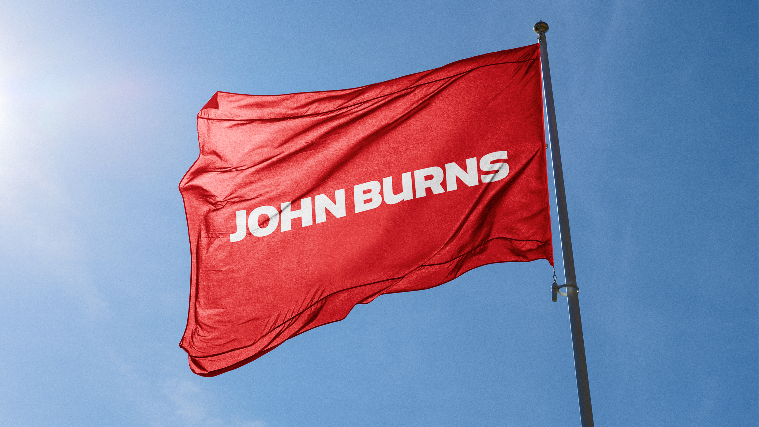
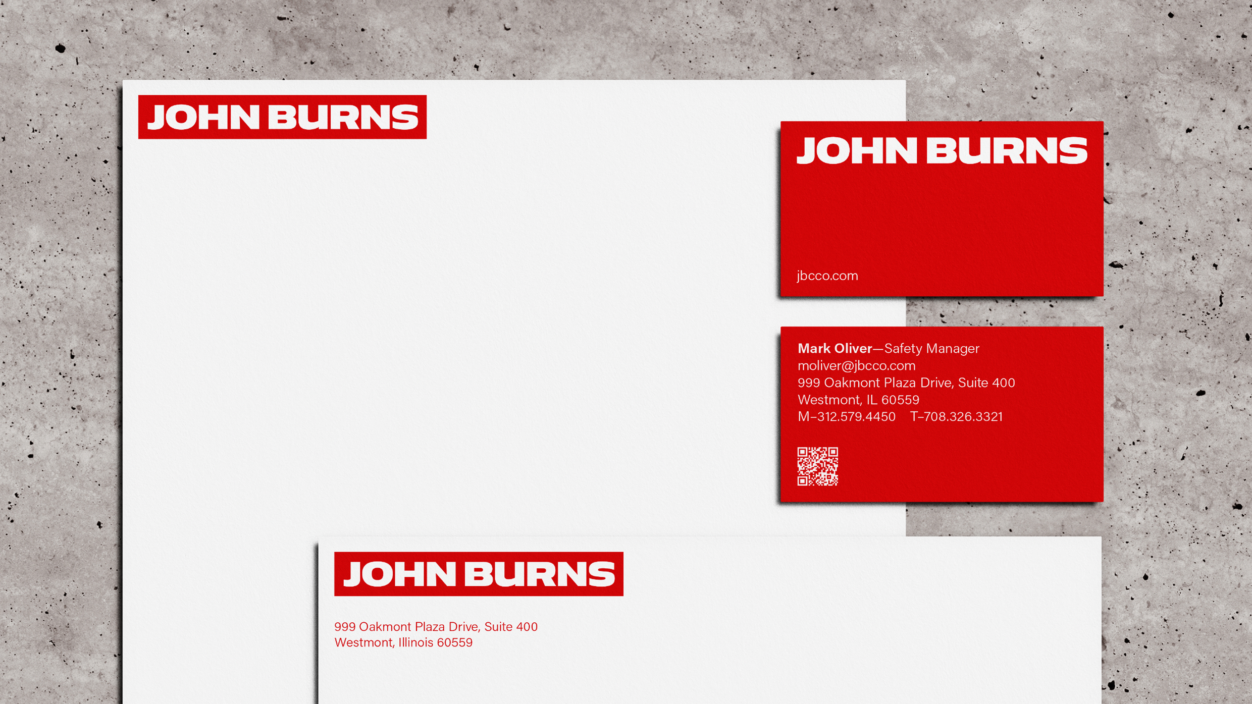
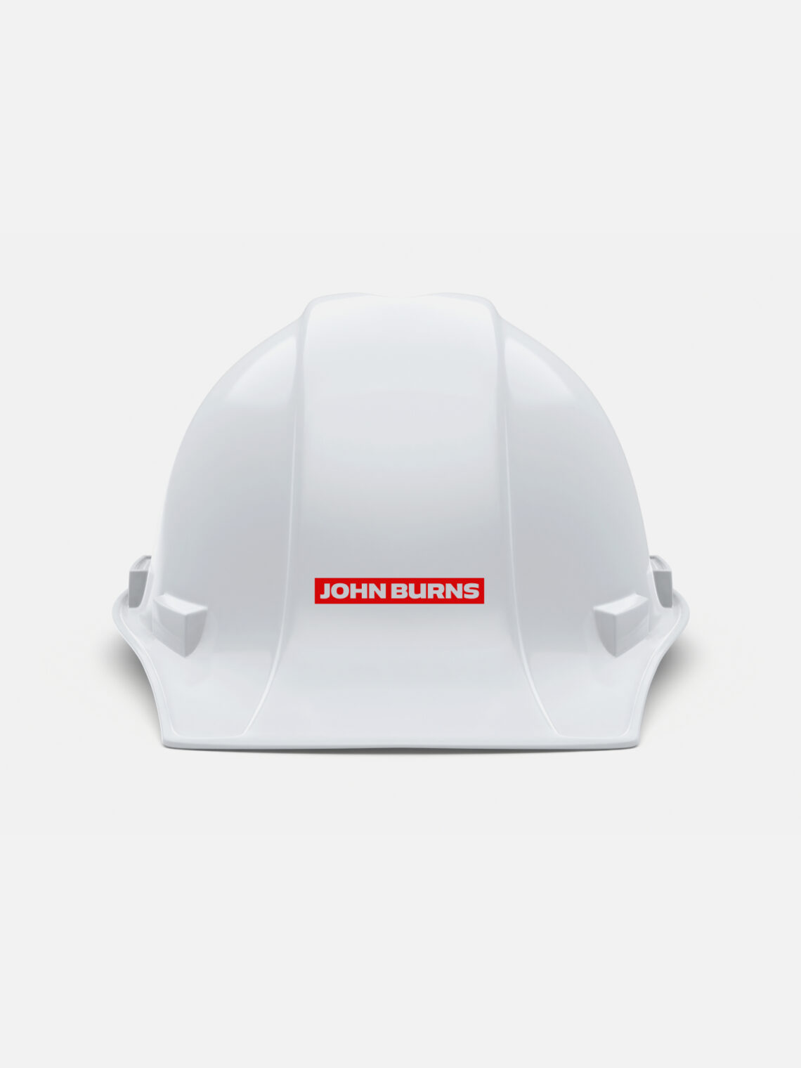
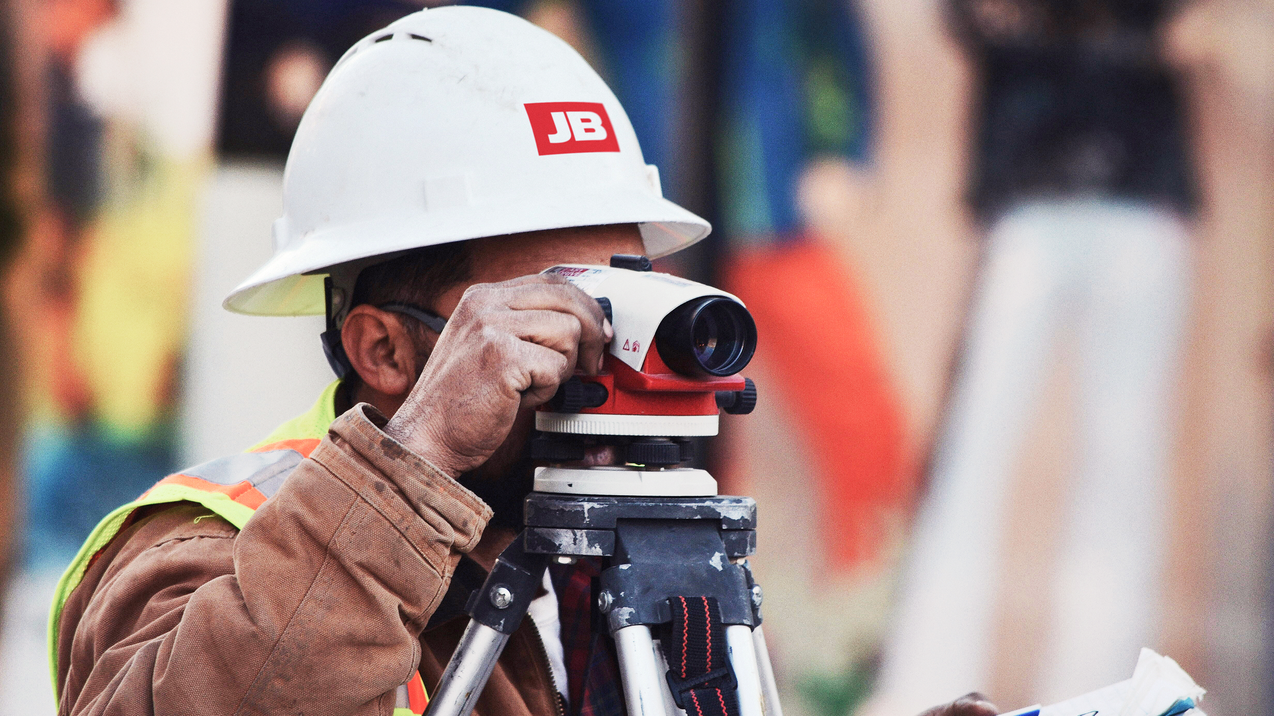
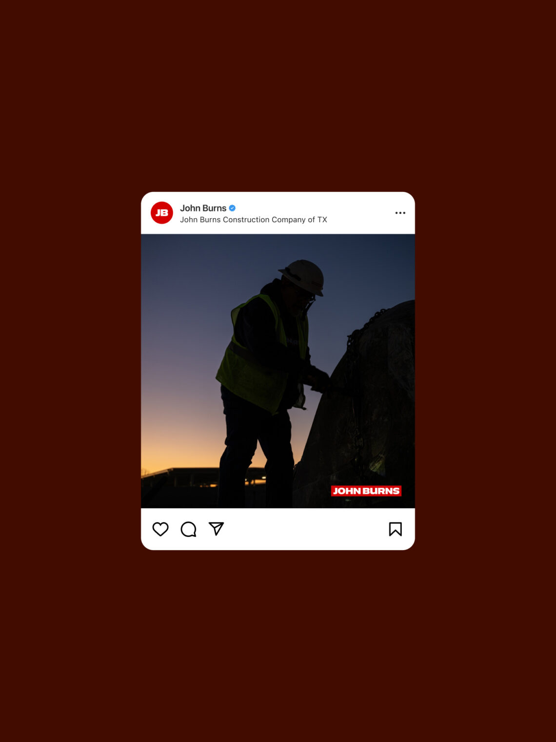
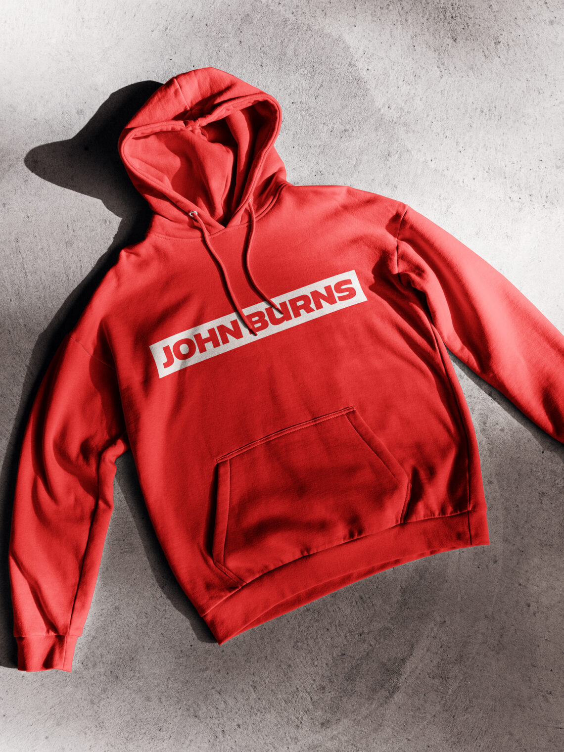
Most brand refreshes focus on the pitch. John Burns needed something different. The hard hat a foreman wears, the flag flying over a project, the hoodie a crew member puts on at 5:30 AM, the business card a safety manager hands to a site inspector. Every surface where the brand showed up was a surface where the work actually happened, and the brand had to belong there.
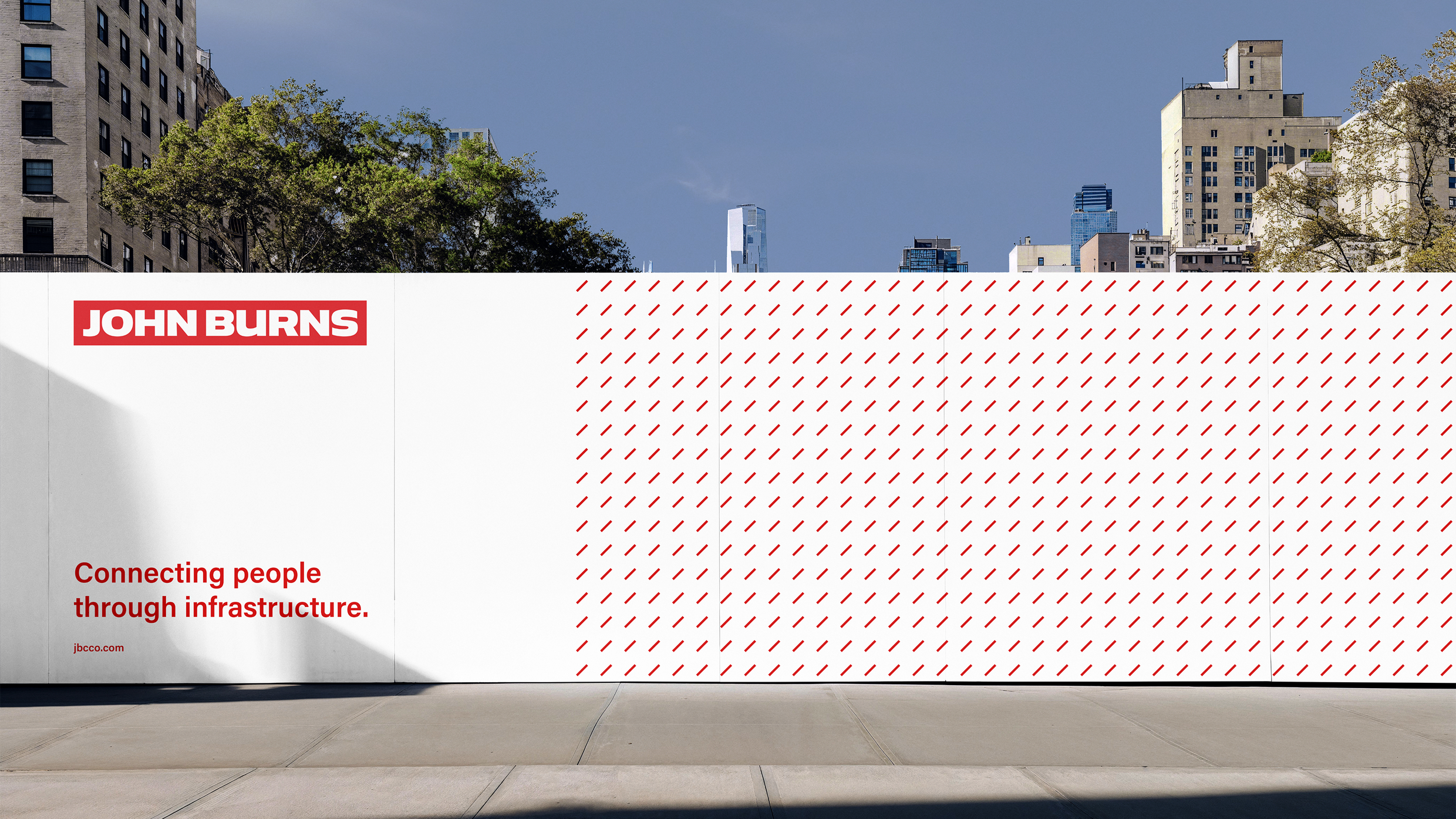
We built the identity system around that reality. The mark reproduces cleanly on a vinyl banner or a stenciled barrier. The red and white palette echoes the visual language of infrastructure safety without looking like PPE. The typography carries the same discipline across a hard hat sticker and a 200-foot site wall. WHQ delivered the full system: identity, environmental applications, apparel, stationery, and a website that communicates the company’s utility, transit, and infrastructure capabilities.
Result
John Burns entered its next century with a brand that matches the discipline of the operation behind it, showing up consistently on every vehicle, every site, every crew member, and every document that carries the name. A 120-year-old company does not need a new brand. It needs one that makes the next 120 years possible, and now it has it.