Maple and Ash
A celebratory brand for a Modern Steakhouse
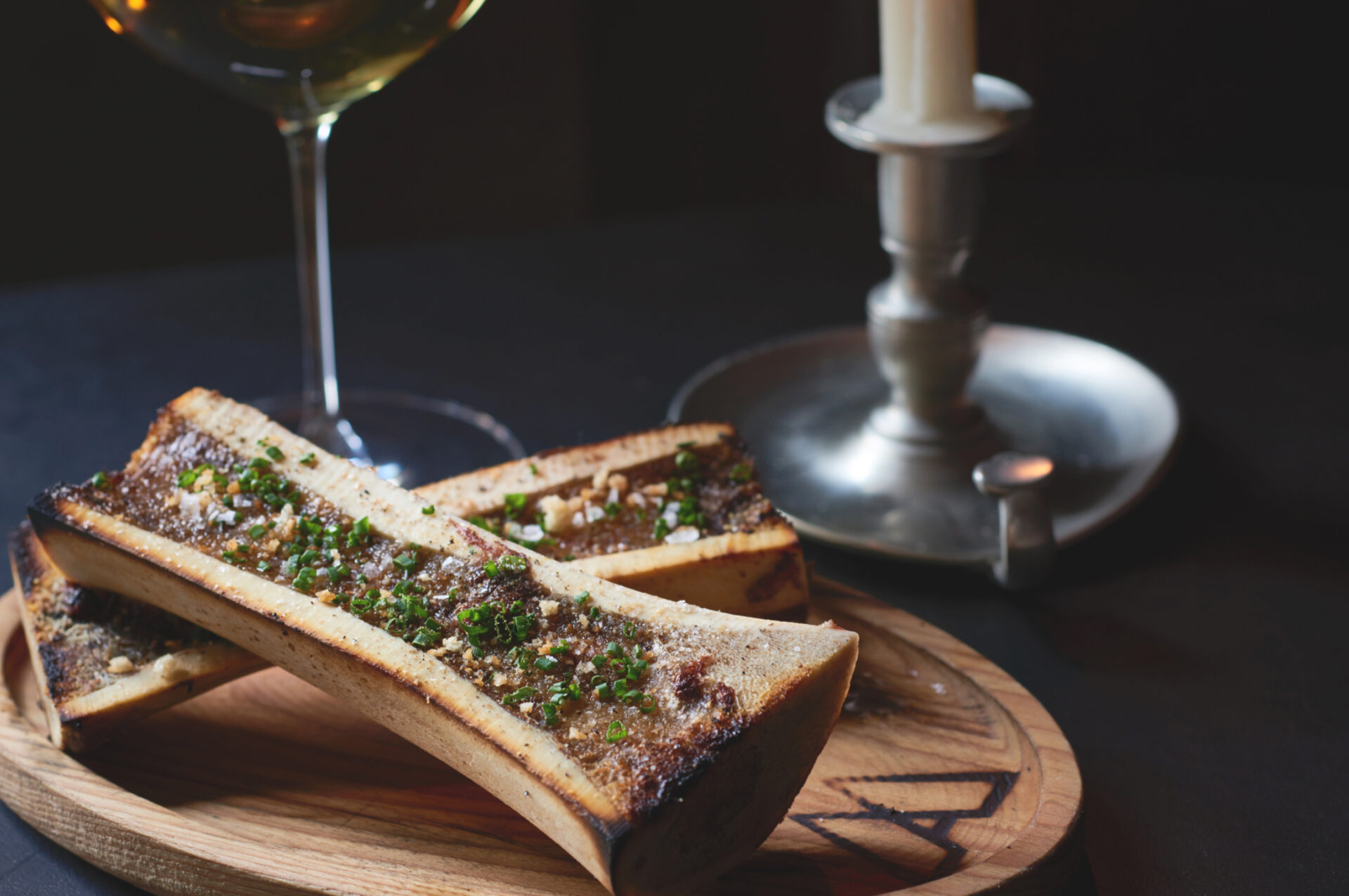
Maple & Ash, a steakhouse named after the two woods used to fire its menu, approached us to craft a brand to match its bold, celebratory spirit. Focusing on pushing the boundaries of traditional fine dining, they needed a brand identity that felt as authentic and luxurious as the experience they delivered. After immersing ourselves in their vision (authentic, celebratory, and bold), we set out to design a brand that would reflect that character.
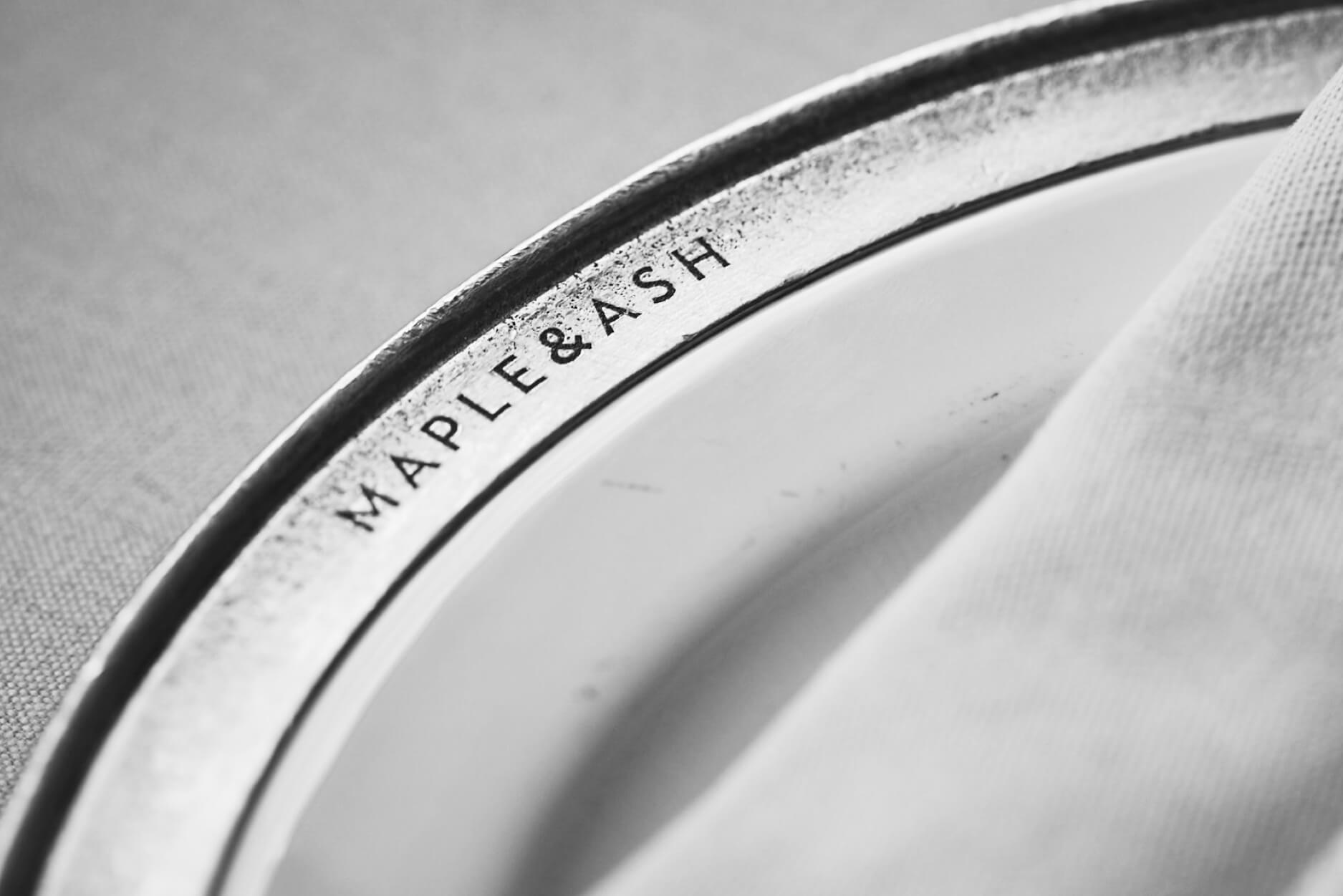
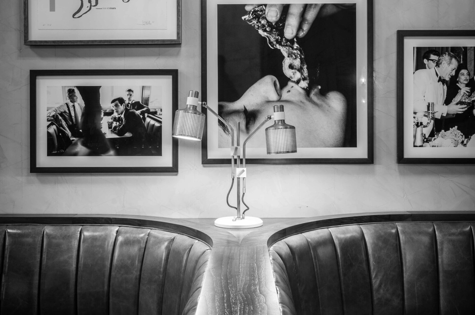
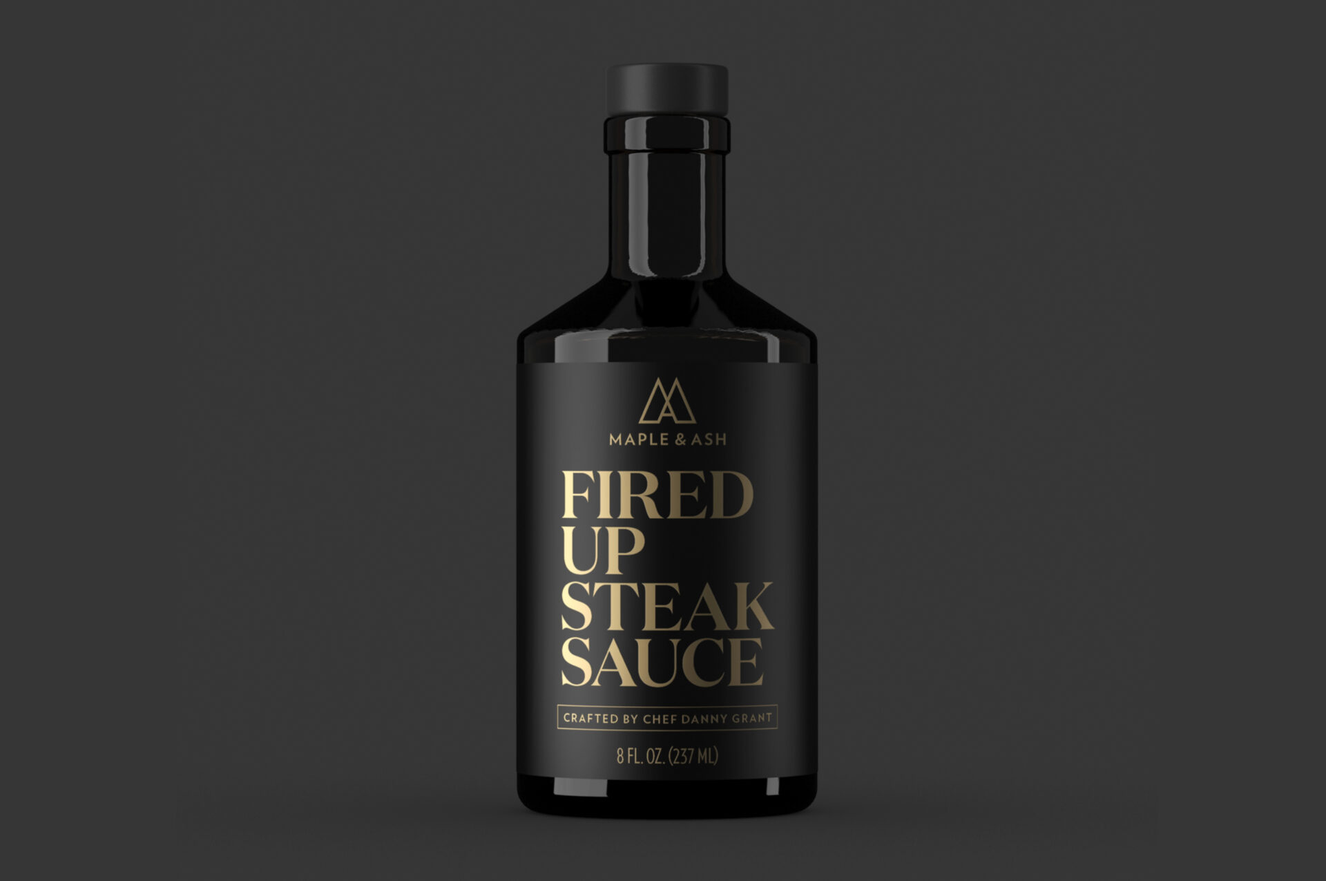
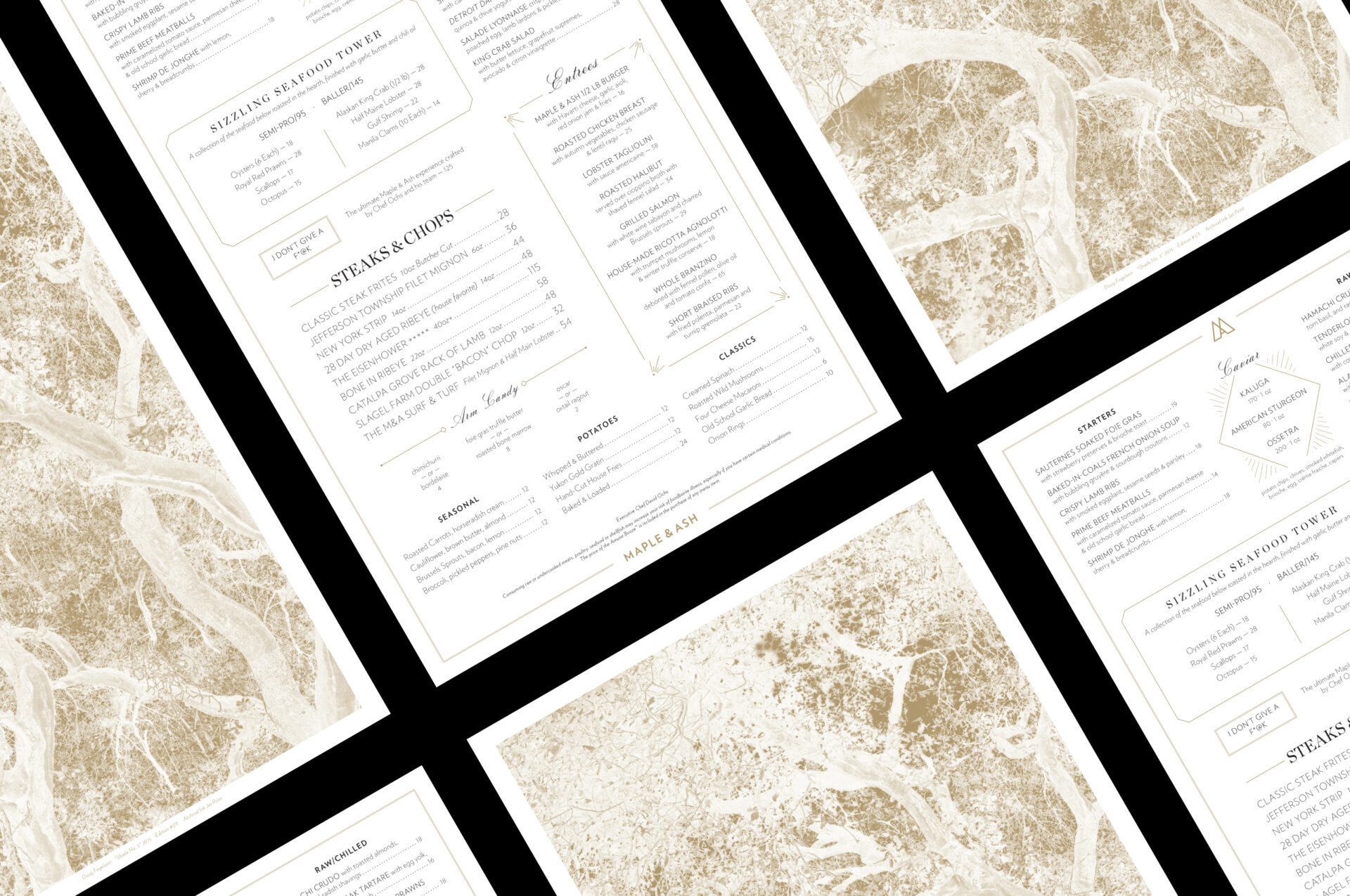
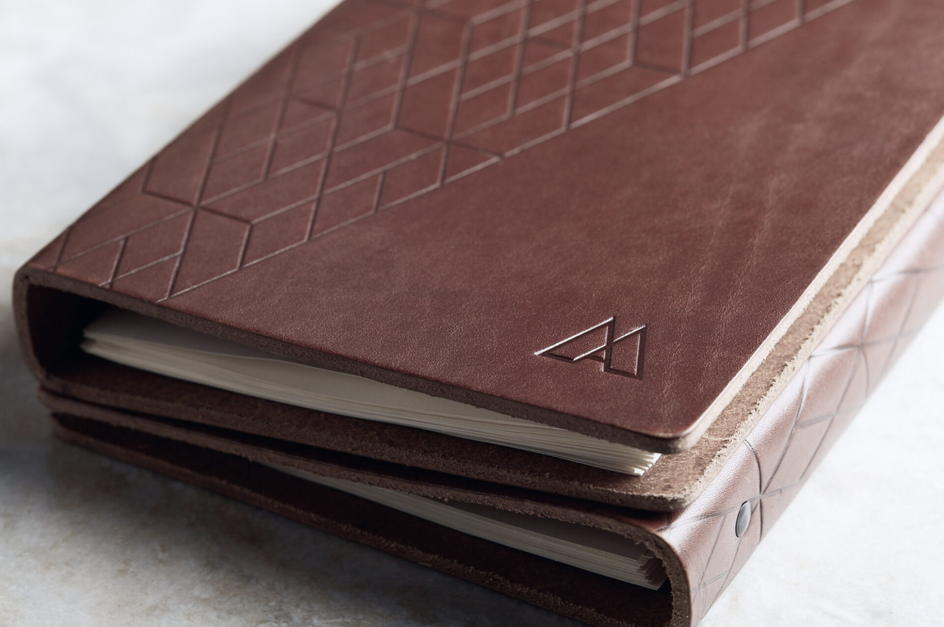
Collaborating closely with the Maple & Ash team, we developed a brand that balances sophistication with a hint of rebellion. The logo—a monogram reminiscent of cattle brands but designed with the sophistication of a finely tailored suit—blends classic steakhouse elements with a modern fashion. Every design element we create reflects the restaurant’s unexpected flair, from refined art-deco-inspired patterns to playful typographic combinations. We mirrored the irreverent tone in their menu, where dishes like the “I Don’t Give a F*@k” tasting menu break with tradition and invite diners to embrace indulgence and celebration.
The proof is in the praise. Conde Nast has praised Maple & Ash as the hottest restaurant in Chicago and has received numerous other accolades from top national publications, including Wallpaper, the Wall Street Journal, and Eater.
Developing a brand, literally
Through several collaborative work sessions with the Maple & Ash team, we created an aesthetic that feels part classic steakhouse, part fashion brand. The mark is a monogram, reminiscent of a cattle brand, the very origin of the word brand, yet drawn with sophistication as if it exists on a finely tailored suit. The clean lines and sharp corners form a modern, geometric shape that is symmetrical yet deviant — a strong yet sexy base upon which to build the brand.

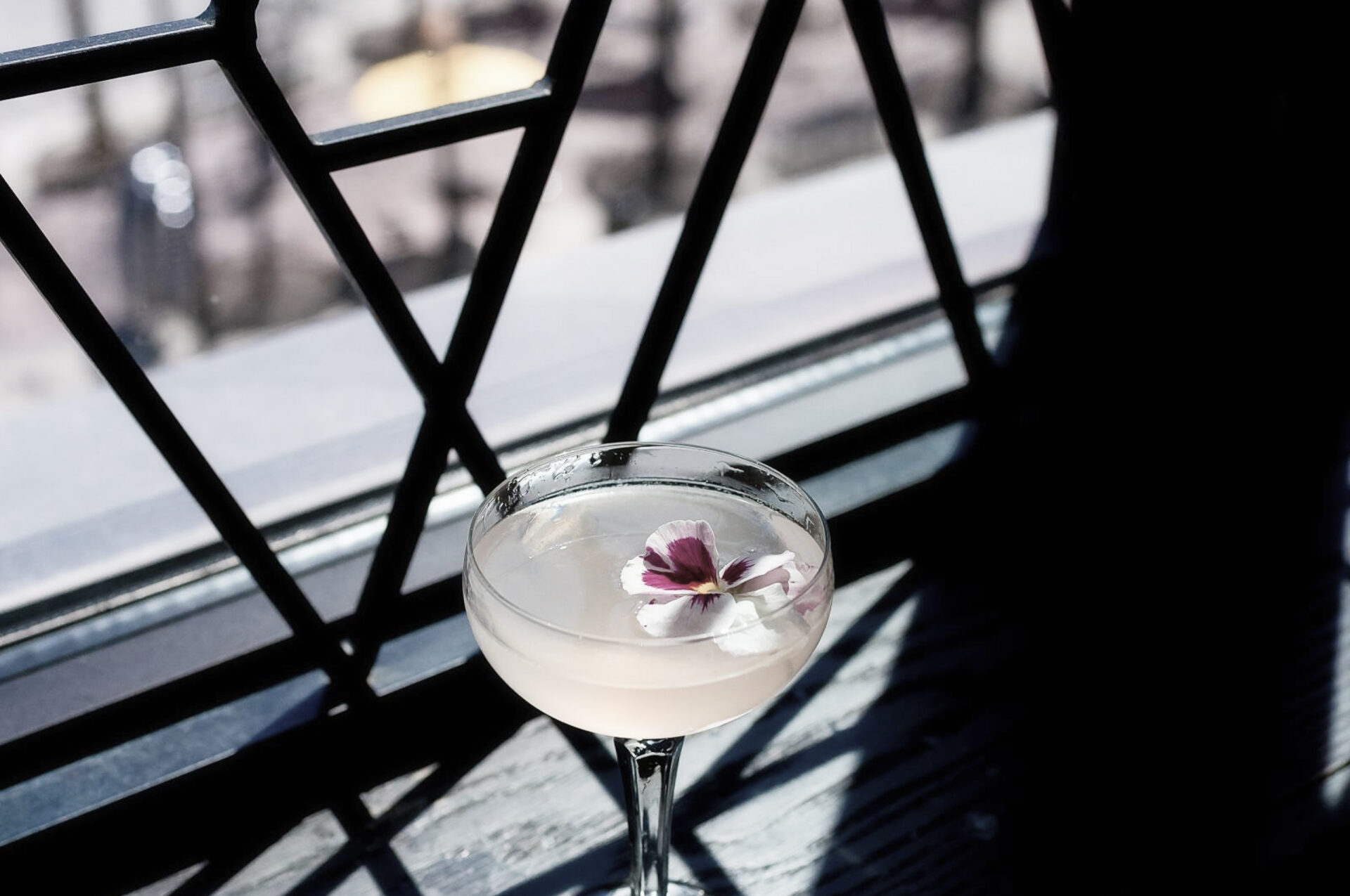
Refined irreverence
With menu items like baller seafood platters and the “I Don’t Give a F*@k” tasting menu that kicks off with caviar bumps and champagne shots, Maple & Ash celebrates classic conventions in unexpected and delightful ways, all in the name of creating celebratory and memorable moments for their guests. We strove to echo this in all aspects of the design, from refined art-deco inspired patterns to bold typographic combinations, to playful illustration and imagery.
The Outcome
The proof is in the praise. Maple & Ash has been praised as the hottest restaurant in Chicago by Conde Nast and has received numerous other accolades from top national publications, including Wallpaper, Wall Street Journal, and Eater.
Industry
Food & Drink