Maple & Ash
A steakhouse brand built on refined irreverence.
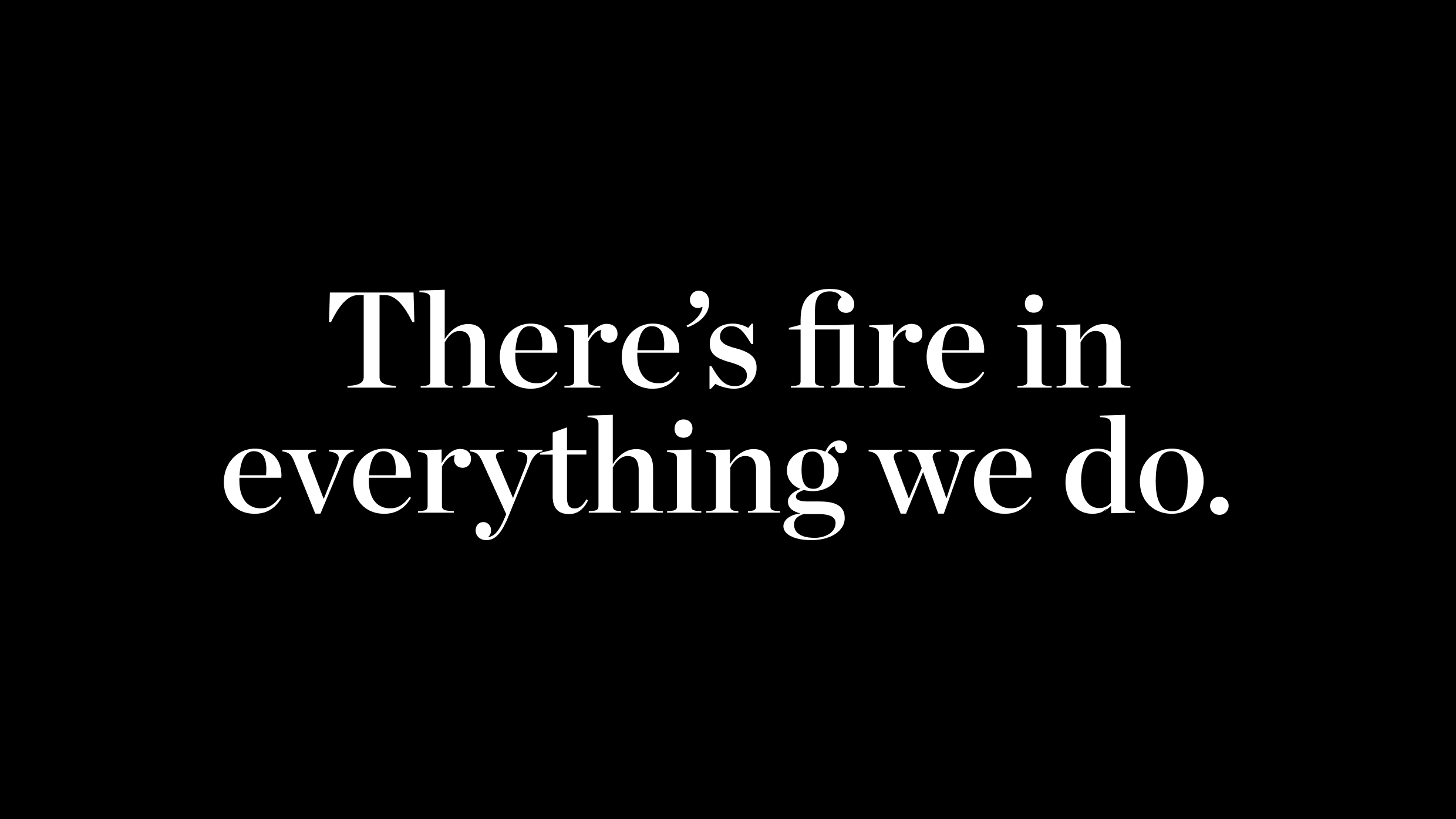
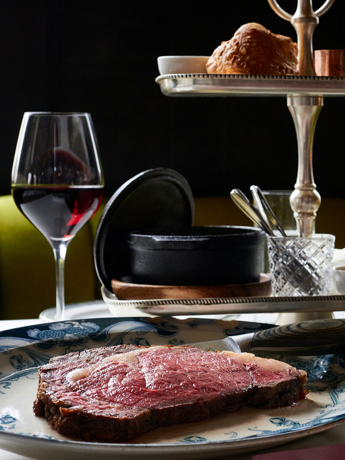
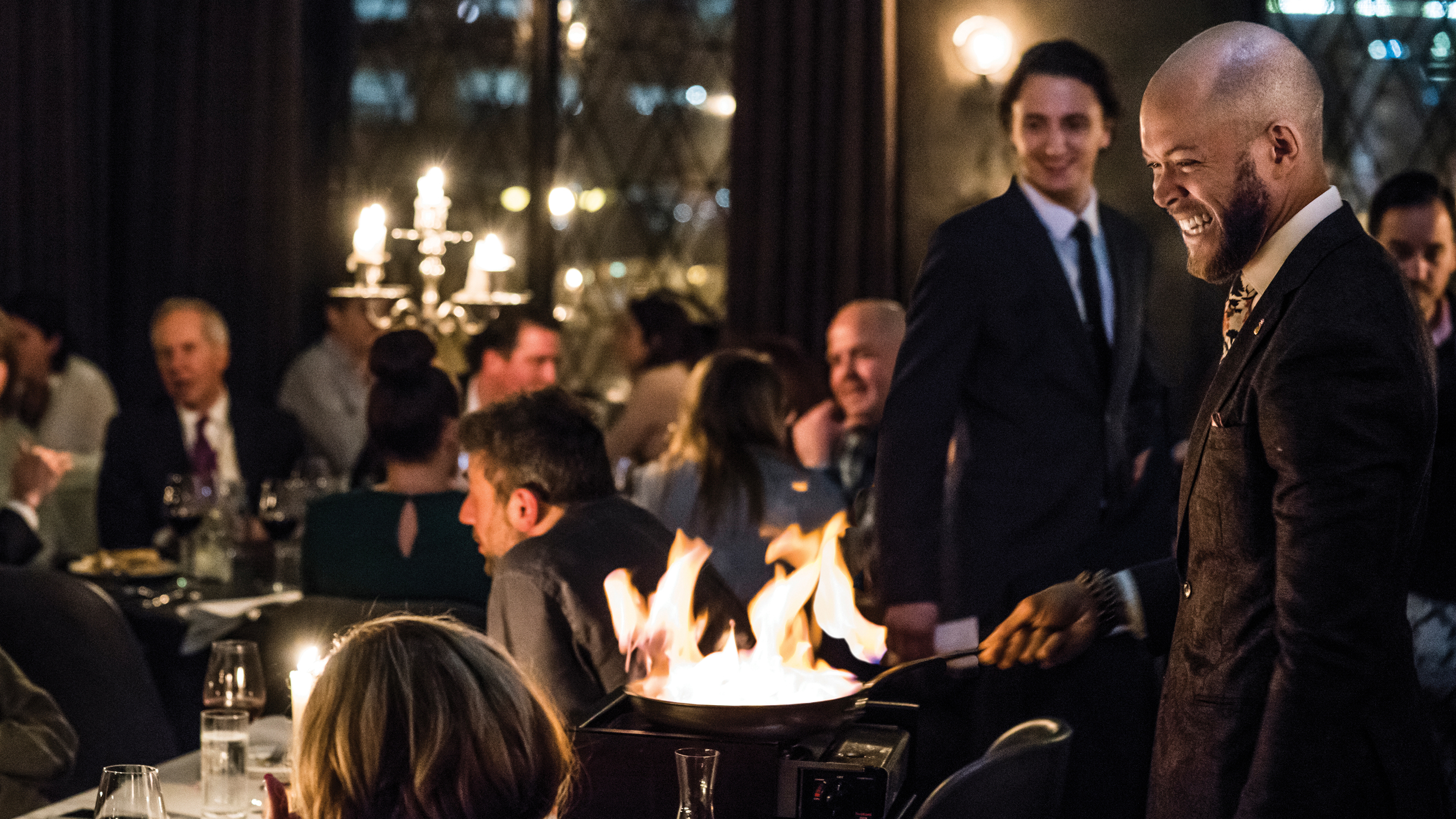
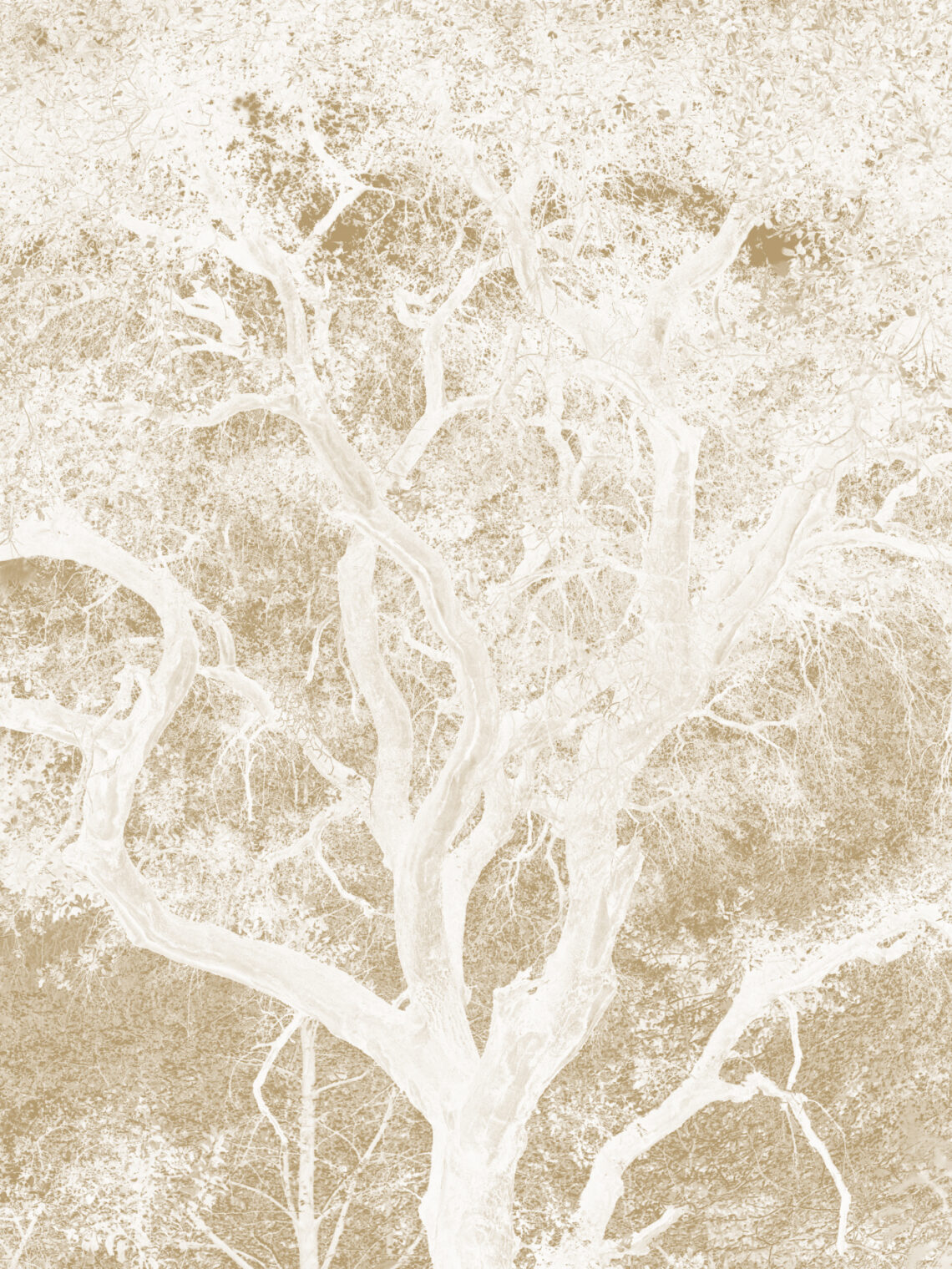
The team at Maple & Ash had a specific vision: a steakhouse that took the food seriously and the formality less so. Named for the two woods used to fire the menu, it would open in Chicago's Gold Coast with two-Michelin-star cooking, one of the most outstanding wine programs in the country, and a tasting menu called "I Don't Give a F*@K." WHQ was brought in to build a brand that could hold sophistication and irreverence in the same hand without dropping either. The positioning we landed on said it plainly, "There's fire in everything we do."
01 — The brief
A new kind of steakhouse needed a new kind of brand
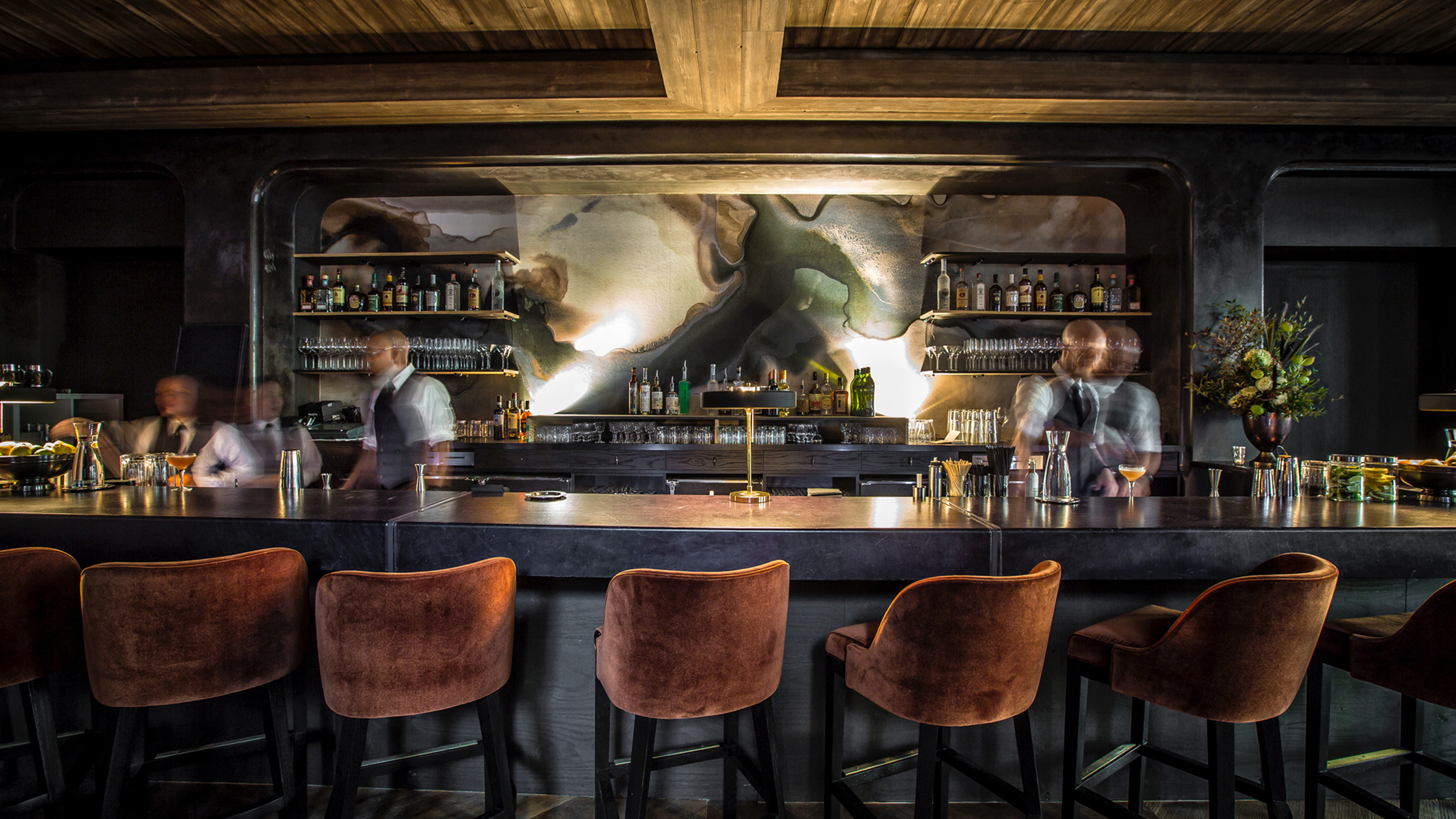
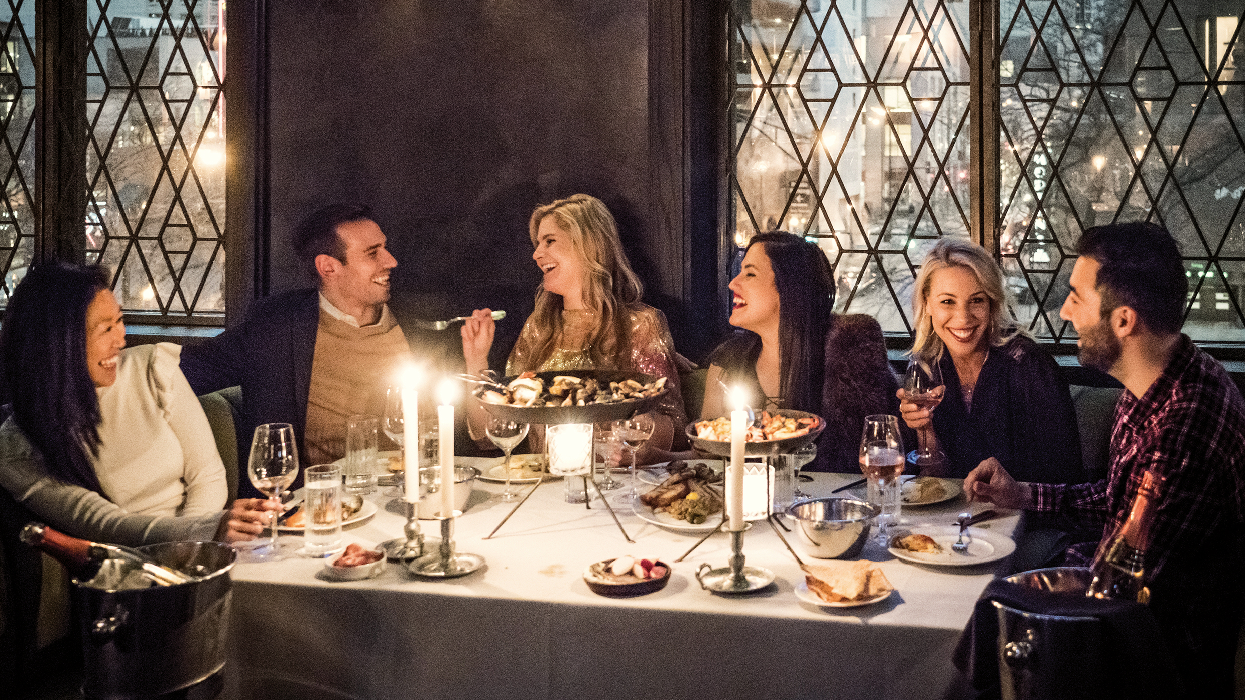
The traditional steakhouse visual language, dark wood, heavy type, studied seriousness, hadn’t changed much in decades. Maple & Ash wasn’t that. It was wood-fired and deliberately celebratory, the kind of place where the dress code says “please come as your elegant selves” and the wine list uses the word “sick” to describe a bottle.
What the brand needed to signal immediately was confidence. What it needed to resist was predictability. The brief was to build an identity that felt as considered as a tailored suit and as playful as the menu that carries it, two things that don’t often live in the same room.
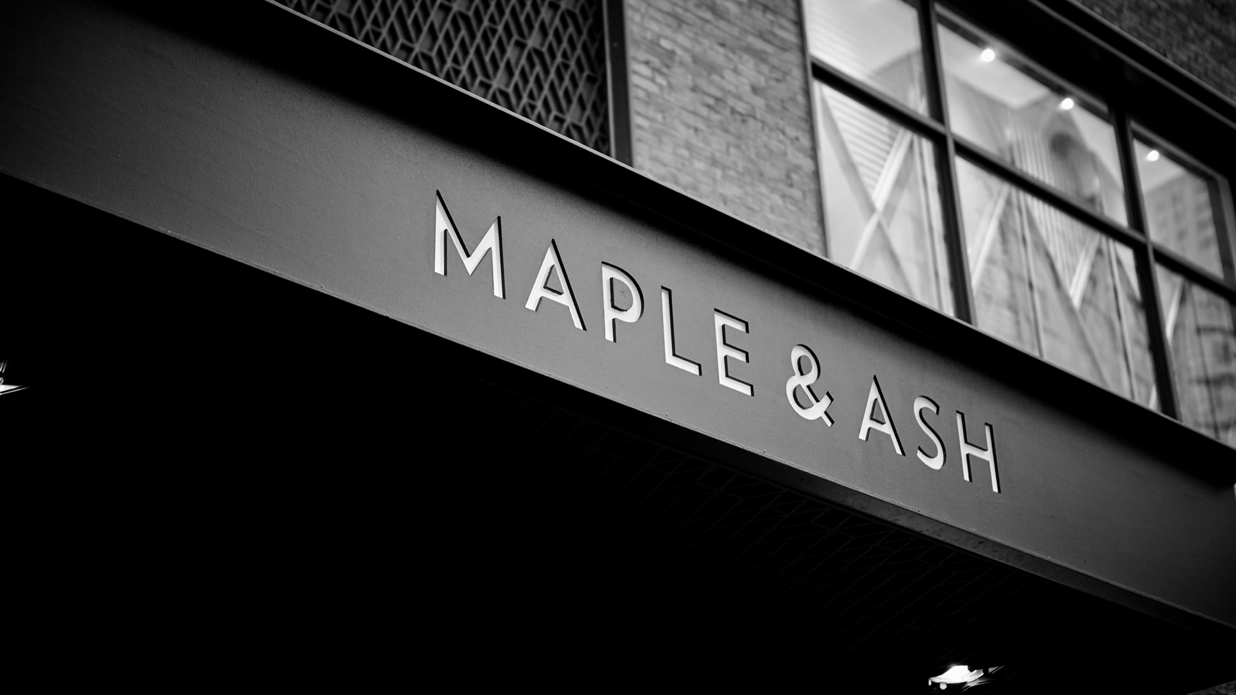
02 — The insight
The mark came from the oldest branding idea there is
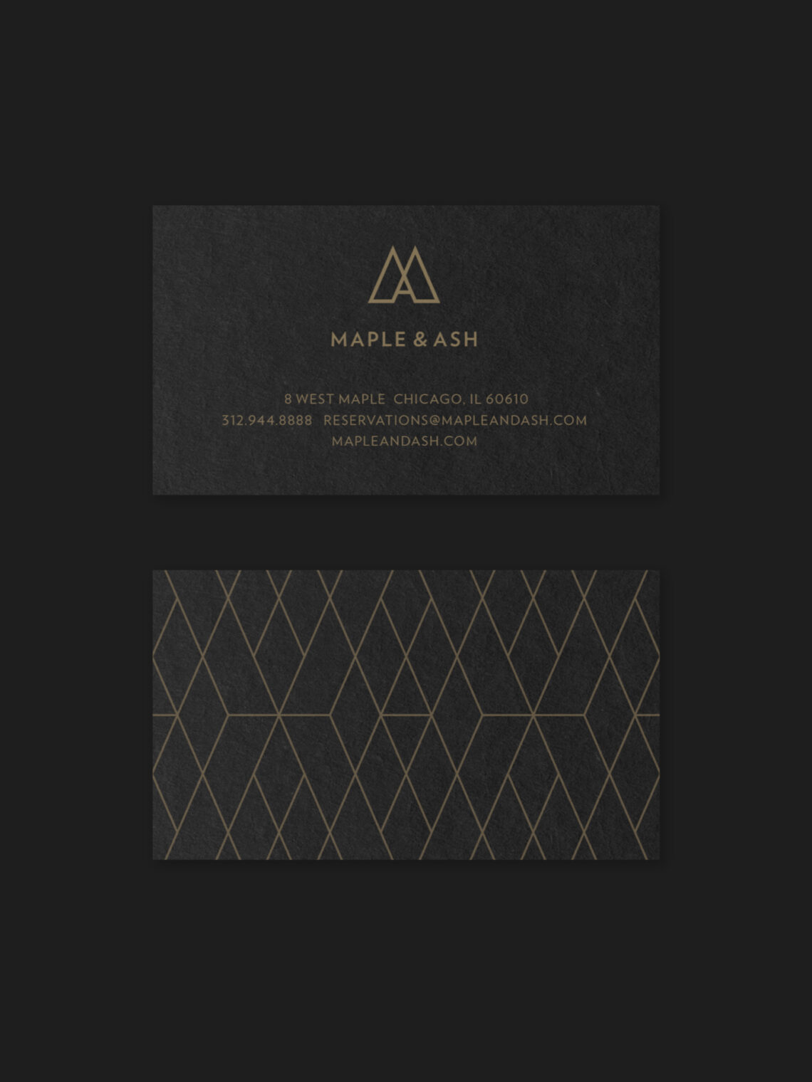
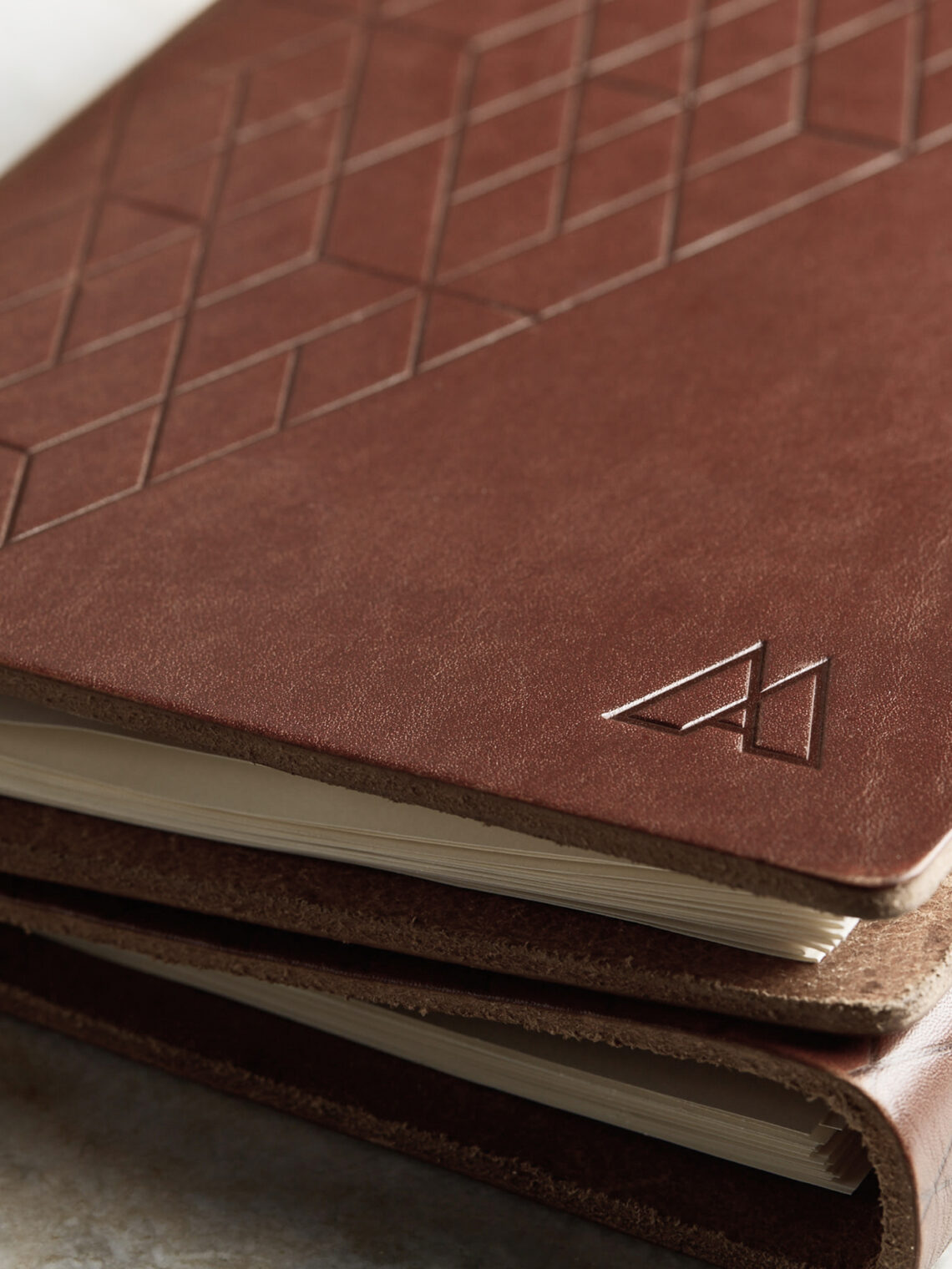
The word “brand” traces back to the act of burning a mark into cattle, the original identity system: simple, permanent, and instantly recognizable. That felt right for a restaurant named after the wood it burns and a team cooking on open flames. A cattle brand alone would have read as rustic. Maple & Ash was sharper than that. So the question became: what does a branding iron look like when it’s drawn with the precision of a tailored suit?
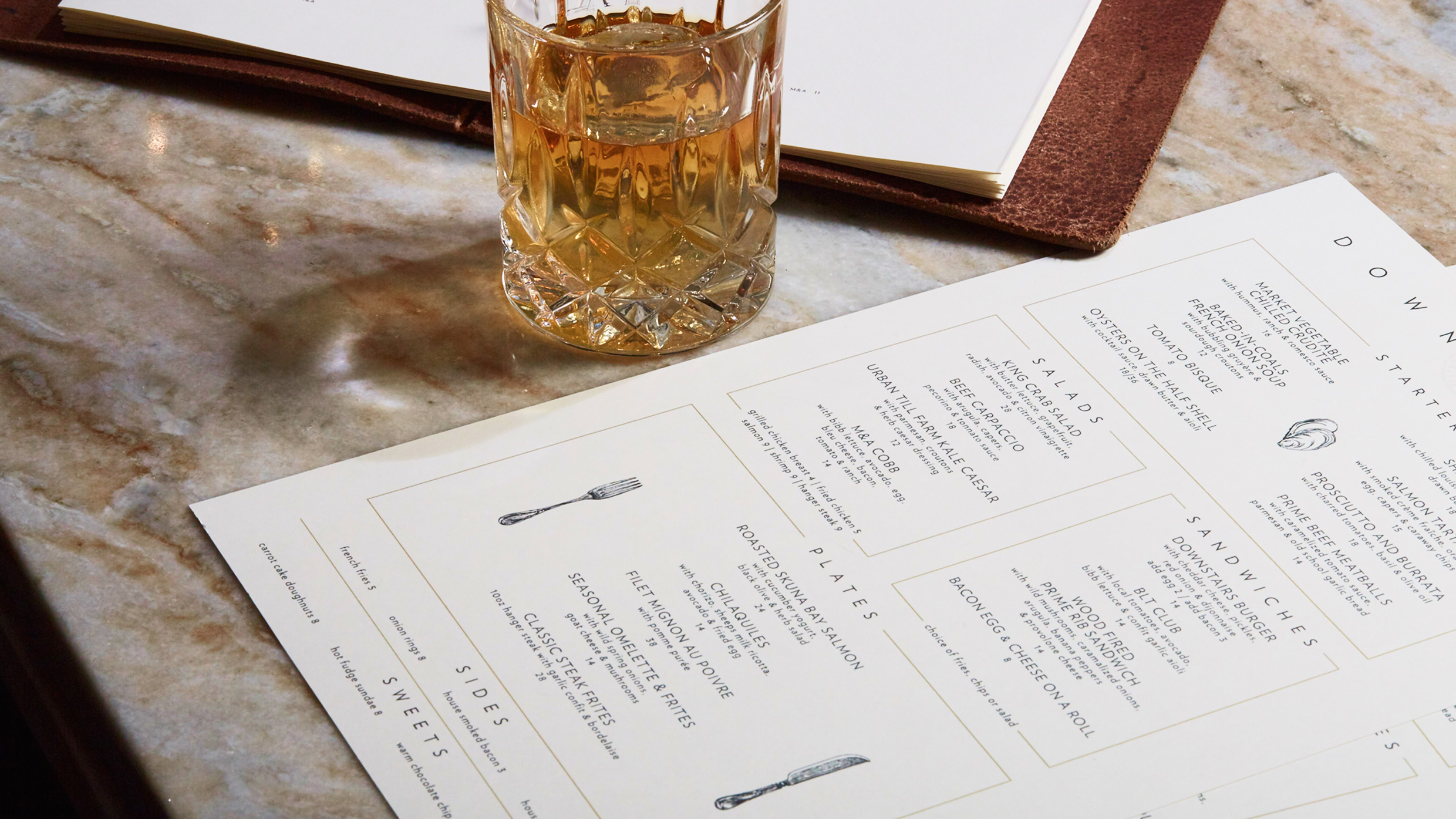
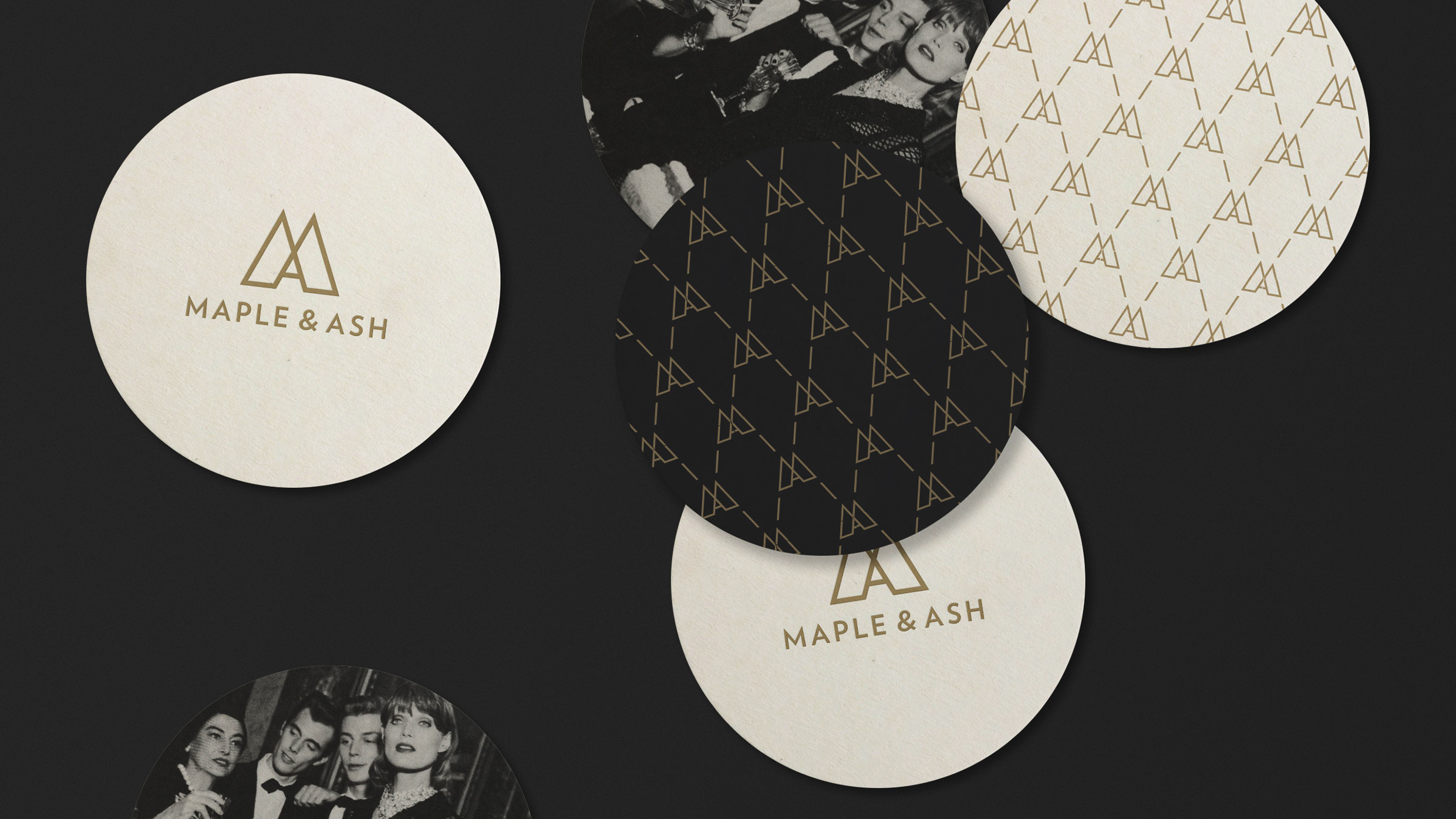
The M&A monogram is the answer, geometric, symmetrical, clean-lined, and just slightly deviant. It has the directness of something stamped rather than designed. It works on a menu cover, embossed on a matchbook, scaled to a custom window screen, reproduced in gold on a cocktail napkin. A mark that could only belong to one place.

03 — The creative
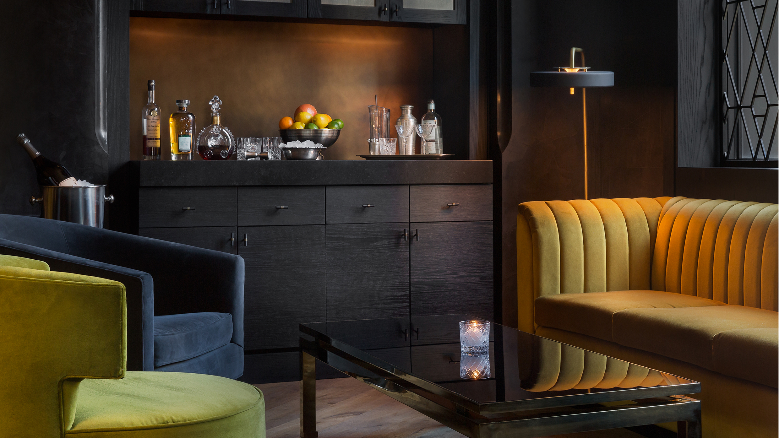
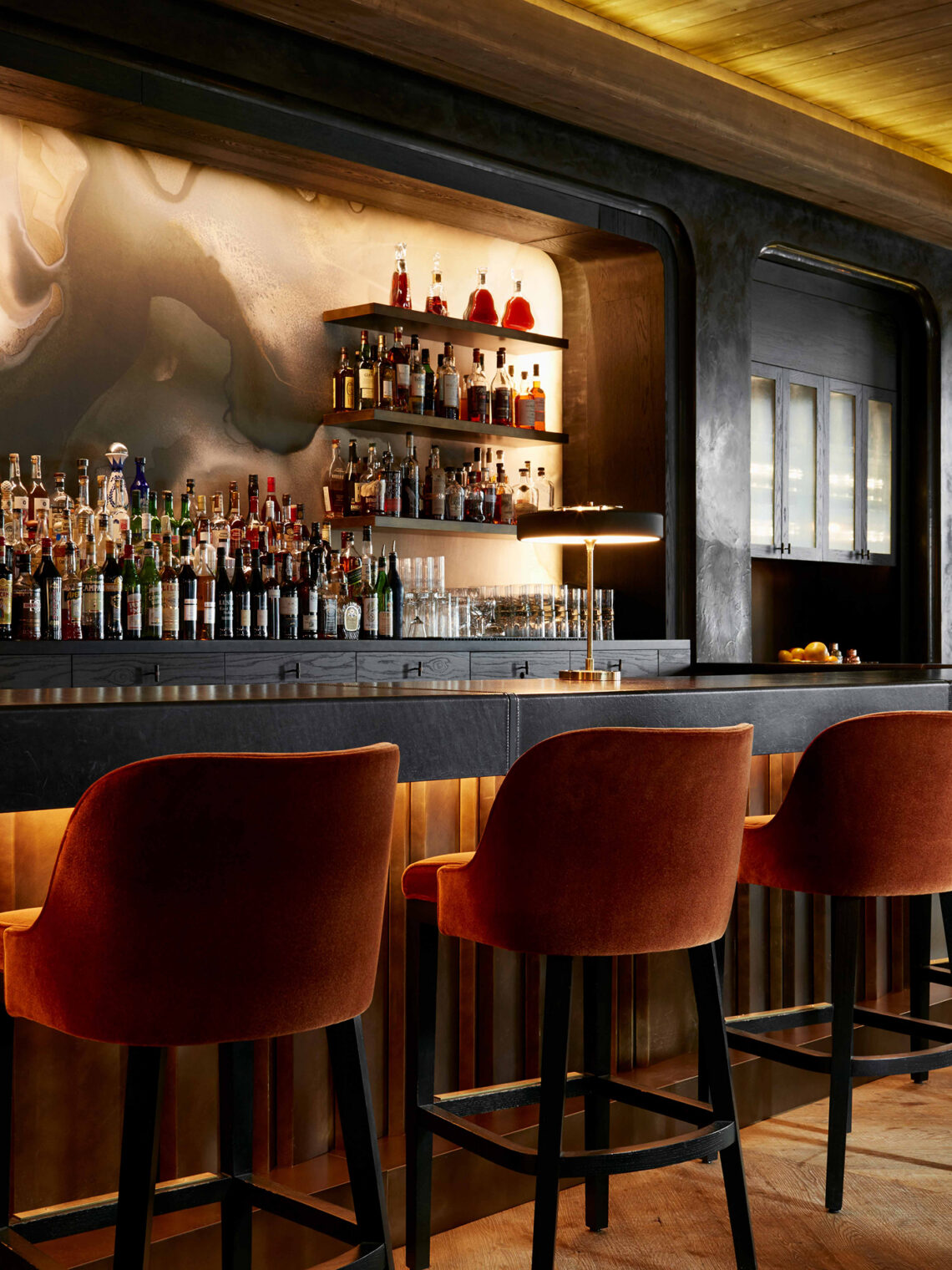
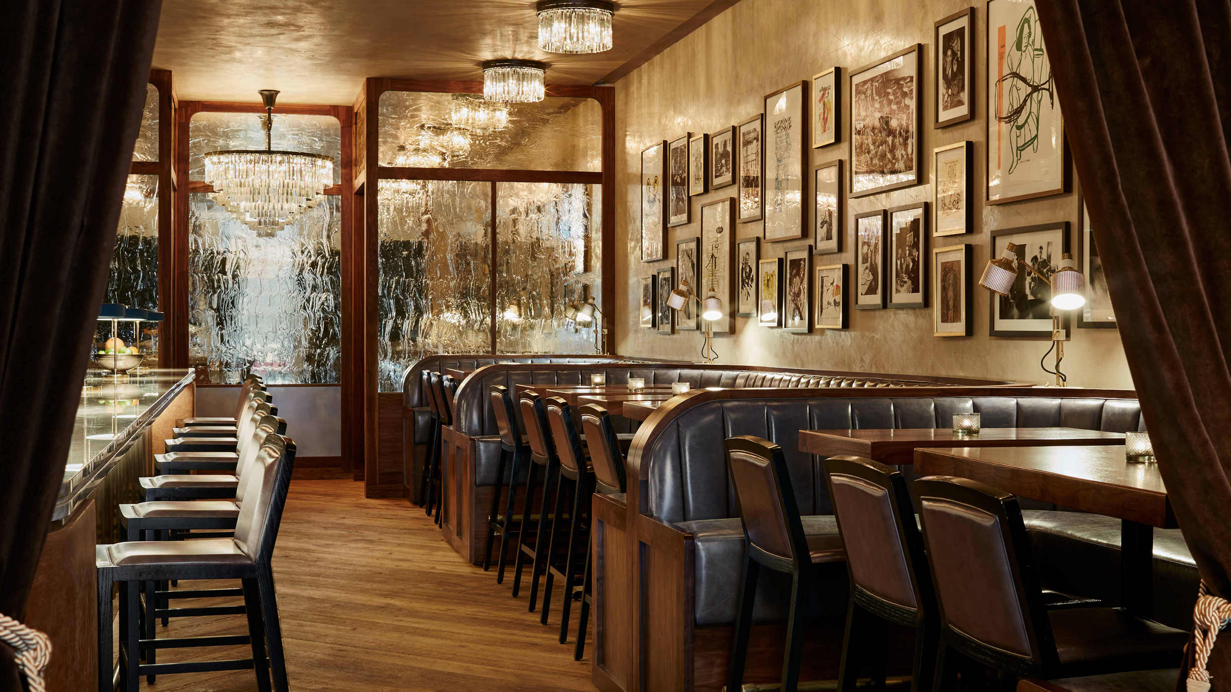
A personality carried across every surface
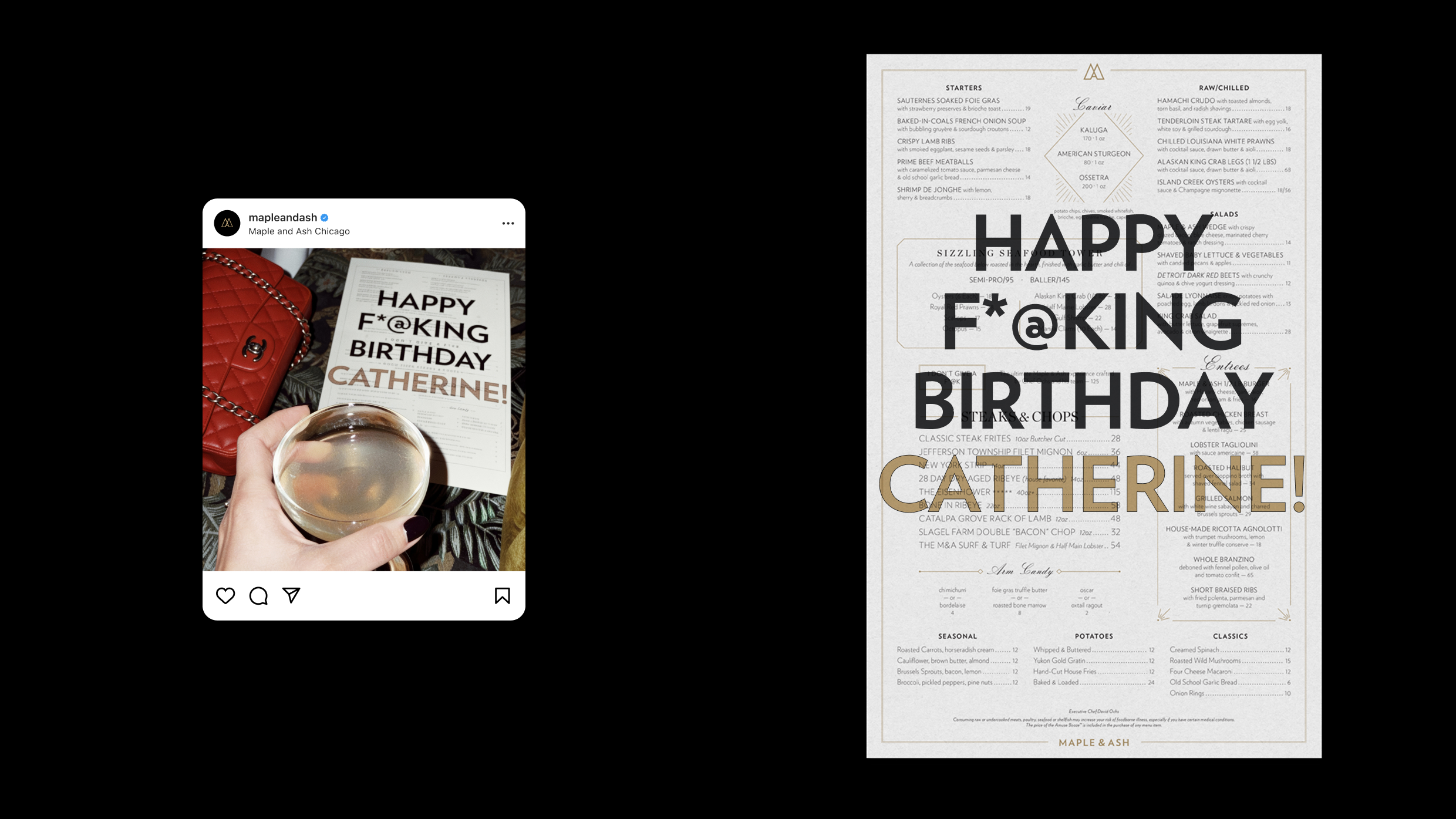
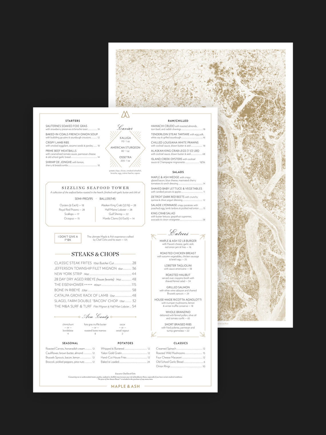
Art-deco-inspired patterns give the system visual richness without becoming ornate. Typographic combinations are bold where they need to be bold and refined where they need to be refined. The menu design echoes the irreverence of what’s on it, a tasting menu get’s boldly printed with “Happy F*@K Birthday” and all other celebrations all delivered with a straight face. The website extended the full system into the digital space, ensuring the brand showed up with the same character wherever a guest encountered it first.

The result
Maple & Ash opened and quickly became the highest-grossing independent restaurant in Chicago. Condé Nast named it the hottest restaurant in the city. Wallpaper, the Wall Street Journal, and Eater followed. The MICHELIN Guide took notice. Wine Spectator called the wine program one of the most outstanding in the world. A decade later the brand has expanded to Scottsdale, Miami, and beyond, with Boston and New York on the way. The brand WHQ built has traveled to every room. Maple & Ash is the first of several brands WHQ has developed with Maple Hospitality Group.
