


What Makes This Category Hard
The branding gap most hospitality brands already know about.
Customers choose on feeling, not features: the identity, the space, and the service all set expectations before anyone sits down. Most hospitality brands treat the website and collateral as an afterthought, when they’re actually the first impression a guest gets.
What Clients Need
What a hospitality brand needs to compete.
A brand identity that signals quality and point of view before a guest arrives.
A unified brand voice, photography, and environmental design.
A reservation experience that feels as considered as the dining room itself.
Print collateral, menus, and packaging that carry the same brand system as the website.
A digital presence that captures atmosphere, not just hours and a phone number.
Brand consistency across new openings, seasonal menus, and multiple locations.
How WHQ Helps
A brand system for every touchpoint.
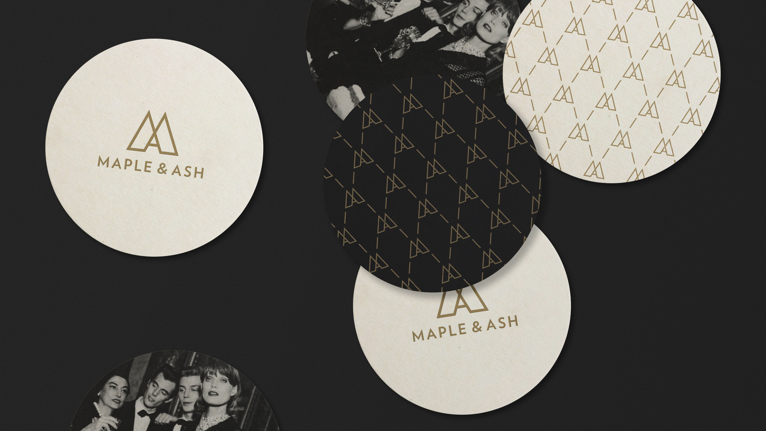
Brand identities that can hold two ideas at once.
Most hospitality brands play it safe in one direction (polished or personality-driven) and stay there. The harder brief holds both at once: precise enough to signal quality, specific enough to stand out, carried through every touchpoint down to the smallest detail.
Maple & Ash needed a brand as tailored as a suit and as playful as its menu. We built the identity around a branding iron mark. It became the highest-grossing independent restaurant in Chicago, recognized by Condé Nast and MICHELIN.
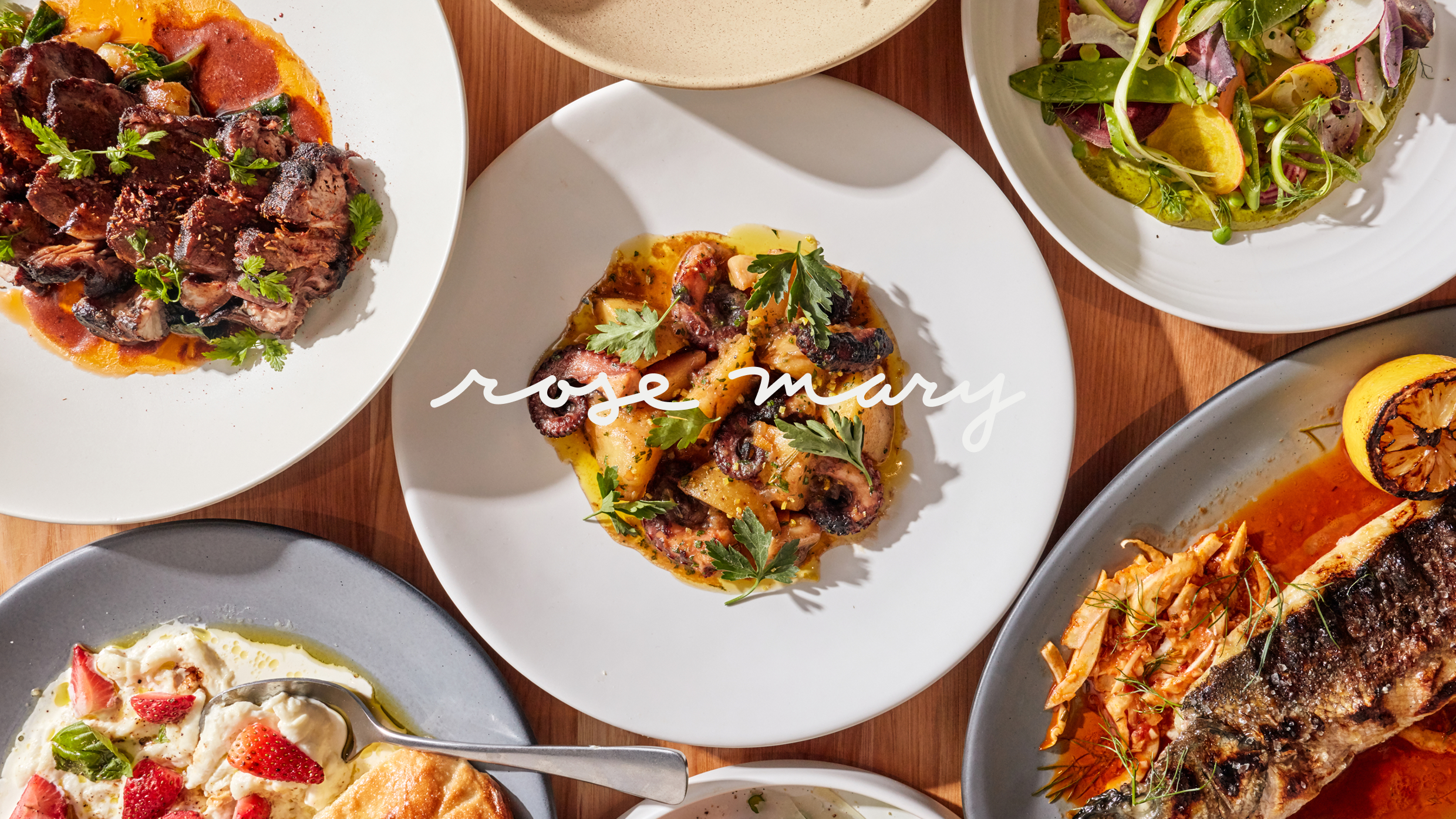
A story this personal can’t be manufactured.
A concept built on real heritage can’t feel invented. It has to feel like it was already there. That takes restraint: knowing when a hand-drawn mark says more than a polished one, and staying disciplined enough to carry a founder’s real story across every surface a guest sees.
For Rose Mary, Joe Flamm’s Italian-Croatian restaurant, we built a hand-drawn identity rooted in Adriatic heritage. The MICHELIN Guide took notice, and the New York Times recommended it within its first year.
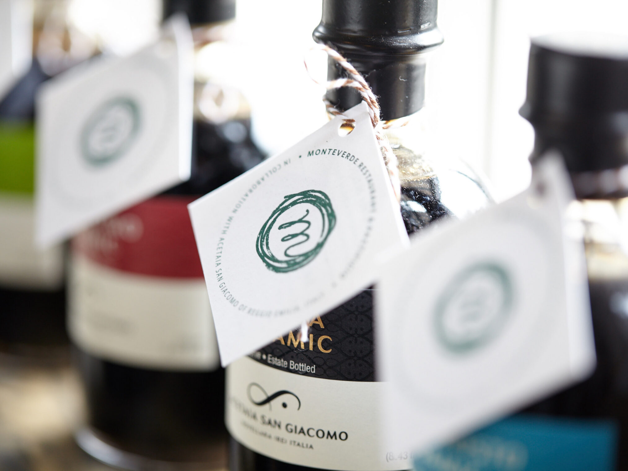
Consistency is the brand.
Naming, tone, identity, packaging, and the website all have to say the same thing, or the illusion breaks the moment a guest looks closely. Holding one point of view everywhere it shows up, from the tile to the takeout box, is the discipline most brands skip.
For Etta, we experienced the hearth firsthand before designing anything. The result, rustic serif typography and hand-drawn illustration, carries through tile, staff uniforms, packaging, and print, so the brand feels as consistent as the food itself.
Planning a launch, replatform, or redesign? Let’s talk.
In the office